| Image |
Comment |
| 07/06/2005 12:19:57 AM |
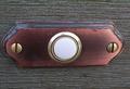
For Whom The Bell Tollsby SecondBestComment: great idea, but why not have it vertical? or is it horizontal in real life? hmm. also shoot directly at it, not from a slight angle. |
 Photographer found comment helpful. Photographer found comment helpful. |
| 07/06/2005 12:19:05 AM |
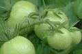
Not Yet Friedby irishempressComment: the focus is shallow and placed in a weird spot (the branch?) stop down for maximum depth of field. = ] |
| Photographer found comment helpful. |
| 07/06/2005 12:17:58 AM |
|
| Photographer found comment helpful. |
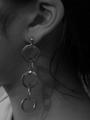
| 07/06/2005 12:17:30 AM |
Leaving Home For The First Timeby VisualOddityComment: lol looks like an obsolete outtake. good technically with the background out of focus just right and the contrast suits the mood well. i see how it's using the challenge subject, but it fits it a little loosely. and you could have used the title to bridge that gap, but it's okay. i still think it's good :) |
| 07/06/2005 12:15:47 AM |
|
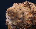
| 07/06/2005 12:15:04 AM |
Unfamiliar Terrainby sfaliceComment: boost contrast slightly to make the background look jet black and the shell to pop out more. why not have it on the sand? very imaginative though! |
| Photographer found comment helpful. |
| 07/06/2005 12:14:16 AM |
Circular Vaseby maiblossomsComment: great color maybe get better depth of field so that the main subject is more of the vase than just the flower though. stop down for more depth of field |
| Photographer found comment helpful. |
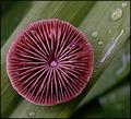
| 07/06/2005 12:13:23 AM |
Top O' The Mornin' To Ya!by MrsFuzzButtComment: very nice composition and texture. i would have moved the other leaves further away to create a nicer bokeh though. i like the colors too |
| Photographer found comment helpful. |
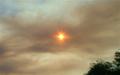
| 07/06/2005 12:12:43 AM |
Smokeby van63Comment: im sure you'll get a lot of comments on this: the bullseye composition is not very good sometimes. and the tree maybe throws it a little off balance. maybe if you included more of the tree to make it more obvious that that is also a contributing element to the pic |
| 07/06/2005 12:11:35 AM |
|
| Photographer found comment helpful. |
Home -
Challenges -
Community -
League -
Photos -
Cameras -
Lenses -
Learn -
Help -
Terms of Use -
Privacy -
Top ^
DPChallenge, and website content and design, Copyright © 2001-2025 Challenging Technologies, LLC.
All digital photo copyrights belong to the photographers and may not be used without permission.
Current Server Time: 08/04/2025 01:05:17 PM EDT.