| Image |
Comment |
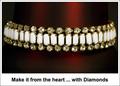
| 04/26/2005 09:05:13 PM |
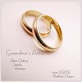
Grandma's Atticby tfarrell23Comment: Crisp shot and great comp. Font should be fatter (is there a bold? or ad it after you save for web) I can't figure out what you're doing with address and why it is consistant. But I like this ad. |
 Photographer found comment helpful. Photographer found comment helpful. |
| 04/26/2005 08:57:30 PM |
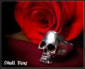
Skull Ringby pawdrixComment: Nice shot, nice font and shaodows. The comp needs to leave more room for text and the skull ring need to be sharper. |
| Photographer found comment helpful. |
| 04/26/2005 08:55:14 PM |
Visit Arizonaby justineComment: I love AZ! I can see details and the shot is very crisp. It is, however, very crowded and a little dark. The font need revision and needs to be more consistant to work in this composition. |
| Photographer found comment helpful. |
| 04/26/2005 08:40:23 PM |
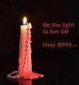
Be the light...by ShamanComment: This has great composition,The DOF is great but I'm not sure what you're trying to sell. There needs to more focus and emphasis on the product. |
| Photographer found comment helpful. |
| 04/26/2005 08:32:57 PM |
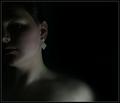
The Earringby saiphfireComment: alot of potential here. Great comp that would lend itself well to text. However, It needs a larger piece or more emphasis on it as I'm really not sure what you're trying to sell. Great photo and lighting. |
| Photographer found comment helpful. |
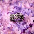
| 04/26/2005 08:29:21 PM |
*by Moose101Comment: I don't get it The shadows are great but the DOF and focus are not effective. comp is good. |
| Photographer found comment helpful. |
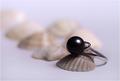
| 04/26/2005 08:23:50 PM |
The Black Pearlby vasilkovayaComment: So crisp and well defined! The comp is lacking and I see so much potential if only the shell were larger and flipped so the ring were inside the shell. the angle would show more of the ring. Your skills as a photographer would keep you in our palm pilot. |
| Photographer found comment helpful. |
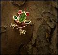
| 04/26/2005 08:19:35 PM |
Entwined with Natureby cheekymunkyComment: This is a great photo of jewelry, The DOF works for me but the background color may be tough to find a font color that stands out enough to deliver the message. |
| Photographer found comment helpful. |
| 04/26/2005 08:15:06 PM |
Suggestiveby mrmorrisComment: Very,very clever. However, You'll need a much crisper shot with enough contrast to really show the tiffany name to pull this off. very creative. Fonts need to be little looser (most don't know how to do this) but overall excellent job! |
| Photographer found comment helpful. |
| 04/26/2005 08:11:03 PM |
|
| Photographer found comment helpful. |
Home -
Challenges -
Community -
League -
Photos -
Cameras -
Lenses -
Learn -
Help -
Terms of Use -
Privacy -
Top ^
DPChallenge, and website content and design, Copyright © 2001-2025 Challenging Technologies, LLC.
All digital photo copyrights belong to the photographers and may not be used without permission.
Current Server Time: 08/13/2025 12:47:29 AM EDT.