| Image |
Comment |
| 10/07/2006 11:17:03 AM |
reflected quencherby bunnygibbsComment: Original idea that needs a more prominent presentation of product. This is just a bit too subtle. Nice lighting and focus. |
 Photographer found comment helpful. Photographer found comment helpful. |
| 10/07/2006 11:08:45 AM |
Some Lead, Some Followby GreeboComment: Nice idea and catchy tag line. Lighting seems a bit harsh but product presentaton is excellent. A little more room on the right would help with text placement. Very nice job overall though. |
| Photographer found comment helpful. |
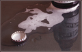
| 10/07/2006 11:05:07 AM |
Pure Substance - IceWaterby GunnsiComment: Great idea but photo seems set up in front of another photo. You do send the message that this is refreshing. Comp is nice but product should be presented more prominently (especially the entire label.) Existing comp lends itself well to text usage. And background is beautiful even if it is a photo. |
| Photographer found comment helpful. |
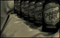
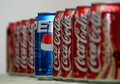
| 10/07/2006 10:57:21 AM |
Canada Dryby SnyderslComment: This could be the poster boy for the trouble with basic editing with an advertising theme at DPC. Great job! A selective desat would help present the product more prominently. But a brightly colored logo and text placed in the negative space would work really well too. (Very nice comp) I do like the rythm effect here but the lead can should be sharper. 7 |
| Photographer found comment helpful. |
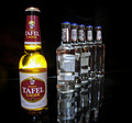
| 10/07/2006 10:47:34 AM |
Hello..... Let Me Inby norlitobgComment: Nice lighting and presentation as well as DOF that focus on the product. I always like contrast ads like this. Only detractions are reflection on the pepsi can and too tight crop that doesn't leave room for text. Still very nice. 8 |
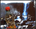
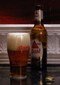
| 10/07/2006 10:45:27 AM |
make mine a Bassby strewComment: I love bass ale and this is a very nicely set up still life that is befitting their reputation (at least here in the US) Product presentation is a little dark and the label would be better if it were facing us directly. DOF would work better if it were more shallow and background is busy and distracting. |
| Photographer found comment helpful. |
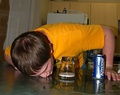
| 10/07/2006 10:40:50 AM |
|
| Photographer found comment helpful. |
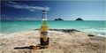
| 10/07/2006 10:35:07 AM |
Miles Away From Ordinary by DanielCzajaComment: Great idea! I love carona's commercials and this could be a still shot from one of them. Great choice of local for your shoot. Comp alllows for east text placement but I'd like to see a tighter crop for two reasons; you could present the product more prominently and it could adjust the comp to be a bit more off centered to make it a bit more interesting. |
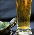
| 10/07/2006 10:30:46 AM |
"Is it a longneck ?"by TajhadComment: Great comp, focus, lighting and DOF. Funny idea. Animals with products they don't consume are always intersting and fun. Nice presentation of product. The composition allows room for text. |
| Photographer found comment helpful. |
| 10/07/2006 10:26:01 AM |
|
| Photographer found comment helpful. |
Home -
Challenges -
Community -
League -
Photos -
Cameras -
Lenses -
Learn -
Help -
Terms of Use -
Privacy -
Top ^
DPChallenge, and website content and design, Copyright © 2001-2025 Challenging Technologies, LLC.
All digital photo copyrights belong to the photographers and may not be used without permission.
Current Server Time: 09/01/2025 03:29:57 PM EDT.