| Image |
Comment |
| 10/24/2006 03:37:47 PM |
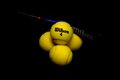
Wilson 4by iianComment: I like yellow and black. And I appreciate the irony of a baseball bat with tennis balls. The photo does not do a very good job of making use of light. For instance, there is hardly any grazing light to inform us of texture. Light from the direction of the camera is the least useful inhelping us percieve the spherical nature of the balls. So lightinng here serves just barely a perfunctory purpose. |
 Photographer found comment helpful. Photographer found comment helpful. |
| 10/24/2006 03:33:25 PM |
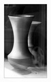
street light...by HairlessmanComment: The diffuse light works wonders in helping us percieve the elegant shape of the pots. And that gratuitous hubcap adds a sense of whimsy to an otherwise very staid and formal composition. I like it. |
| Photographer found comment helpful. |
| 10/24/2006 03:30:30 PM |
|
| Photographer found comment helpful. |
| 10/24/2006 03:30:01 PM |
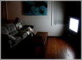
Transfixedby madhatterComment: I love this photo; it is sly and subtle and it makes quite a good social commentary. A very good looking young person who somehow from a distance manages to depict a sense of intelligence and health and grace wastes away staring at pure nothingness. It takes a while for the affect to soak in, and I would be surprised if it scores very well. I hope I am wrong. |
| Photographer found comment helpful. |
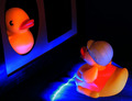
| 10/24/2006 12:16:05 PM |
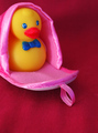
Peekaboo!by KitaComment: Hi, Greetings from the Critic's Club:
INITIAL IMPRESSION: a split second after seeing the photo I said, "cute" Every element in the photo aids in that impression, the background, the ducky, and the pink slipper.
COMPOSITION: I find the red to be an unintuitive but inspired background that brings a great deal of warmth to the photo while directing our eyes effectively at the subject. I like the positioning of the subject in the frame - rule of thirds and the angled gaze across and toward the lower right corner of the photo. The silk slipper, however, is the element that absolutely nails the 'cute' impression; and I find iit to be inspired. The competition was full of ideas that placed rubber duckies in very novel situations or ones that challenged our basic conception of rubber ducky, and I think many such photos scored higher.
LIGHTNG and TECHNIQUE: The lighting works very well to communicate that ducky is nestled inside the slipper. It is warm, cheery, diffuse, and brings out vibrant yellow and blue tones. Focus is a bit more of a problem. Ducky is fuzzy. My personal reaction is that the level of fuzziness might actually add to the atmospheric warmth of the photo, but some voters at this site can be quite brutal in scoring photos that show the least bit of softness. In this case the photographic element that suggests softness in focus was accidental is the fact that the loop in the slipper is in very crisp focus. This draws our attention away from a vital element toward a distraction, draining the photo of vital energy.
CONCLUSION: The photo is a strong idea and it communicate 'cute' effectively. Voters went for more novelty and greater sharpness in scoring this competition.
Best of Luck
Steve Brubaker |
| Photographer found comment helpful. |
| 10/23/2006 09:41:19 PM |
Welcome Home, Dearby levyj413Comment: Greetings from the Critic's Club :
FIRST IMPRESSION The premise of this photo is quite funny and the photo conveys that sense of fun.
COMPOSTION: The use of diagonal lines works marvelously: the diagonal line connecting the lines of sight of the subjects and the diagonal line of blue light. The setup does raise the question about whether Mr Ducky is really welcome, the door seems to be closed - perhaps Mr. Ducky will have to climb in through the window? Somehow, it looks like a long way up and there are no steps. Good thing Mr. Ducky can fly!
LIGHTING; The lighting is very interesting, but it is easy to be of two minds about it. I find the bright strip of light interesting, and I find its reflection on the Ducky Home to be quite attractive. On the other hand, when reflecting off Mr & Mrs. it looks a little eerie and menacing. I also find the Mr Ducky's tail is lit much better than Mrs Ducky's face, and that bothers me. There is a nice balance between well-lit subjects and shadow spaces which makes the subjects pop out.
PHOTOGRAPHIC TECHNIQUE: The image is fairly crisp and clear without noise. The camera angle is effective. There is just about enough DOF, although Mrs Ducky is noticably more fuzzy than Mr. Ducky.
OVERALL IMPRESSION: It is a humorous photo, carefully taken. The novel use of light adds interest, but there are some possibilities for improvement in lighting and focus.
Good Luck.
Steve Brubaker |
| Photographer found comment helpful. |
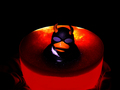
| 10/23/2006 08:55:05 PM |
Evil Bathby MegaweaponComment: Greetings from the Critique Club :
FIRST IMPRESSION: I love the bright colors, especially the red, glowing bathtub. And I find the evil ducky to be very funny.
COMPOSITION: The composition captures my attention and conveys the message quickly. I find that it fails to keep my interest once I get the joke. The wide black margin is effective in drawing our eye to the red bathtub, but there is a way in which the subject is plopped in the middle of the photo, that creates a bit of a static feel to the photo. The glowing orange light around the head works well to delineate ducky from his background very effectively, which is great. The head-on lighting, though, augments the static feel of the photo.
LIGHTING: Mostly, I find the lighting effective. There are lots pf places where the glowing qualities really make the photo shine. There is, however, a white strip around ducky's neck that appears to be a reflection and I find it distracting.
PHOTOGRAPHIC TECHNIQUE: The photo is crisp and clear, free of obvious flaws. I can't help but wonder whether the treatment might have been improved with a longer lens and a shorter DOF. This would further help the eye distinguish ducky from bath. I also wonder whether a lower camera angle might have helped to make ducky a little more menacing. Any ducky who looks like that deserves to be taken seriously!
EDITING: Burning to remove a distracting toilet bowl proved a wise choice. So did hiking up the saturation. Did you consider cloning out the flecks of lilac light in the water in front of ducky?
OVERALL: It is an effective, humorous shot for this competition. |
| Photographer found comment helpful. |
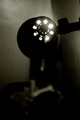
| 10/22/2006 10:00:25 PM |
enlightenmentby tigerhavenComment: For some time I imagined the photo to be ironically titled. I like the moody, grainy sense and the glowing bits from the light. I don't find the placement of the light in the photo to work well for me, and I kind of wish I could see a little less of the BG. |
| Photographer found comment helpful. |
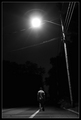
| 10/22/2006 09:55:56 PM |
Into The Darkby strickerblue21Comment: I am impressed with the use of line as well as the use of light. For instance, I love how the telephone pole looms menacingly and the stripe leads the eye into the dark. Finally, I love how well you tell a story with such a small part of the photo. Great shot. |
| 10/22/2006 09:49:08 PM |
|
| Photographer found comment helpful. |
Home -
Challenges -
Community -
League -
Photos -
Cameras -
Lenses -
Learn -
Help -
Terms of Use -
Privacy -
Top ^
DPChallenge, and website content and design, Copyright © 2001-2025 Challenging Technologies, LLC.
All digital photo copyrights belong to the photographers and may not be used without permission.
Current Server Time: 08/01/2025 02:28:18 AM EDT.