| Image |
Comment |
| 10/28/2006 02:23:12 PM |
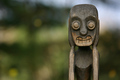
Whiteby kwiktorComment: I lik the rhythm and the high key sense of this shot - how the lines all point at the model's face. But I really wish the model's face were much clearer. And try as I might to see some I find no bokeh. |
| 10/28/2006 02:15:47 PM |
Bokeh in the Bushby isonajComment: Lighting is fantastic, and so is the model. It is an interesting, perhaps slightly contrived pose, but that stare sublime.Very Nice. |
 Photographer found comment helpful. Photographer found comment helpful. |
| 10/28/2006 02:11:13 PM |
|
| Photographer found comment helpful. |
| 10/28/2006 10:04:36 AM |
|
| Photographer found comment helpful. |
| 10/28/2006 09:58:30 AM |
|
| Photographer found comment helpful. |
| 10/27/2006 10:33:13 PM |
Manangby ocninonComment: I find those metal hoops draw all my attention, and they somehow seem to do it more when they are at the edge of the photo. The white shirt in the light and the darker face in the shadow presented some very difficult choices which are handled well given the circumstances, but the shirt still strikes me as being allost overpowering. I like the hat, the expression, the overall composition, and the color pallet. |
| 10/26/2006 06:16:11 PM |
Happy Aloneby Joey LawrenceComment: I stumbled onto this photo by accident today and I decided to give it another look. I actually remember voting for this photo fifteen months ago. I remember the face, the smile, and the black chain running in front of the face. I remember being charmed by that smile and being bothered by that chain. I see that I rated it a seven back then, when I almost never gave photos higher ratings. But I see now that I underestimated this shot. I think that has happened a lot.
Not only is there a chain running through the shot, there is a chain motif running through the shot. Emilie's smiling eyes bring a spirit to the photo that somehow transcends chains, overthrows them, not with violence but with charm and spirit. Really, this is an artful shot. Bravo. |
| Photographer found comment helpful. |
| 10/26/2006 05:58:33 PM |
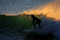
eluding the sunby boysetsfireComment: Hi Nick,
Greetings from the Critic's Club
INITIAL IMPRESSION: The water in this shot is quite impressive - the scattered light in wave, the orange light of the sun on the mist, and the reflection of the blue sky in the foam. One is not used to seeing surfers in silhouette, and this adds novelty to the photo.
COMPOSITION and LIGHTING: The real strength of the photo, IMO, is the strong lighting. One has the sense that the saturation has been artificially boosted a little, but this does increase the dramatic effect of the lighting. There is something about the surfer's stance that suggests unsteadyness and this produces a mildly negative visceral reaction in me, but it may actually strenghthen the appeal of the photo to some other observers. It's a quibble, but I wish the line of the wave did not slice through the surfer's head. I know these are not all things under a photographer's control.
PHOTOGRAPHIC TECHNIQUE: The short DOF works well and helps us understand the shot. The subject is in focus and stop-action is good. One is tempted to wish for better highlights in the foam around the surfboard, and perhaps some dodging might have helped here. Similarly, I have the sense that dodging or burning other parts of the photo might help us scan it better and improve its effect. Given that the orange mist was essential in communicating the morning theme, this treatment is a good choice.
OVERALL: It is a solid photo with much to commend it.
These comments are just my opinion, I hope you find it of some value.
Best of luck,
Steve Brubaker |
| Photographer found comment helpful. |
| 10/24/2006 03:50:10 PM |
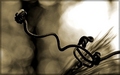
Distortionby ltlmschrisssComment: The observation that this light looks interesting reflected in this surface is a good one. I have the sense that the reflection is more interesting than the light itself. I wonder if you considered the idea of trying to make most of the phot be of reflection ( I assume it is a spoon ) It might have been interesting to have small bits of the original going across a corner of the photo so we know what we are looking at. Good choice to desaturate. |
| Photographer found comment helpful. |
| 10/24/2006 03:45:53 PM |
A Moment in Light and Timeby whitewolfComment: I like the rhythm of the panes here, and there is a funky appeal to the composition that I kind of like. The light is clearly strong, but the mullions break up the photo so much that one has the sense that it would be essentially the same photo in any light. the photo appears to be highly over-saturated: It produces an attractive glow in the yellow house and the distant brick chimneys, but the strong blue cast in the trim tattles on you. I wish the guy in the bottom left corner were gone. |
| Photographer found comment helpful. |
Home -
Challenges -
Community -
League -
Photos -
Cameras -
Lenses -
Learn -
Prints! -
Help -
Terms of Use -
Privacy -
Top ^
DPChallenge, and website content and design, Copyright © 2001-2024 Challenging Technologies, LLC.
All digital photo copyrights belong to the photographers and may not be used without permission.
Current Server Time: 04/18/2024 01:57:15 AM EDT.