| Image |
Comment |
| 04/27/2005 09:55:59 AM |
|
 Photographer found comment helpful. Photographer found comment helpful. |
| 04/27/2005 09:55:40 AM |
|
| 04/27/2005 09:54:53 AM |
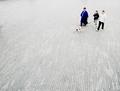
Must... Find... Lampost...by MatthewComment: Very funny. The seemingly endless woodwork decking works well for this photo. The subjects are perfectly placed, and the colors of the clothing work perfectly. I'd prefer it if the photographer seemed a little more invisible - if the subjects' gazes all were parallel with the dog's. Nice shot. |
| Photographer found comment helpful. |
| 04/27/2005 09:51:21 AM |
Burningby soupComment: Kinda wish for just a little more flower, a little less shadow. Still, it's a very nice shot. |
| Photographer found comment helpful. |
| 04/27/2005 09:49:05 AM |
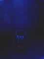
All goneby jensmustangComment: The invisible subject; very minimal. I can see that the rim of the bowl is in focus, yet the photo has a kind of blurry quality to it that really bothers me. I think part of it is due, ironically, to the fact that the blue background seems to have more crisp texture in it than the subject bowl. ANd the placement of the bowl seems a little haphazard. I like the blueness. |
| 04/27/2005 09:45:24 AM |
|
| Photographer found comment helpful. |
| 04/27/2005 09:44:12 AM |
Jarby DiscraftComment: Withdrew my entry of a flower on a black background entitled 'BUG.' Love the static, formal presentation. of white on black. |
| Photographer found comment helpful. |
| 04/27/2005 09:41:58 AM |
NO RISKby ZSANNAComment: A question I wrestled with in this challenge was whether 'a very small' part of the image could be 'not visible at all,' decided it wasn't. Not sure this photo captures any of that invisible risk. I like the choice of backgrounds, find the arrangement a little cluttered for my tastes. |
| 04/27/2005 09:35:21 AM |
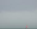
Sea Mistby PeterCComment: No question that it meets the challenge. It's atmospheric, but my impression is that the boat is just a little too weak a focal point and the haze is just a little too monotonous. |
| Photographer found comment helpful. |
| 04/27/2005 09:06:18 AM |
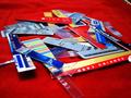
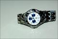
on sale 1,000by gtp1164Comment: Pretty good choice of subject. The straight-on lighting casts harsh shadows. The composition is static, would have been better with left end cropped. Watch is just a little too far away and too unsharp. I want not only to be able to read the brand name, but the little lables in the blue dials. Not finding a compelling reason for the watch to be set on its side. If it is to be horizontal, it would seem a little neater if it were exactly horizontal. Hope some of these suggestions are helpful. |
Home -
Challenges -
Community -
League -
Photos -
Cameras -
Lenses -
Learn -
Help -
Terms of Use -
Privacy -
Top ^
DPChallenge, and website content and design, Copyright © 2001-2025 Challenging Technologies, LLC.
All digital photo copyrights belong to the photographers and may not be used without permission.
Current Server Time: 08/06/2025 01:24:17 AM EDT.