| Image |
Comment |
| 08/06/2005 12:25:18 AM |
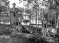
Welcome to the Good Lifeby RonBeamComment: Is that what the German Shepherd is saying? The crisp detail and the lovely light here are exquisite. Super choice going with black and white. This is a really tough composition to pull off but you have done it with aplomb. The more I look at the photo, the more I see ways in which it's inherent clutter could have turned it into a muddled disaster, but I also see how some combination of great skill and luck has pulled everything together. Super Effort. |
| 08/06/2005 12:15:22 AM |
by the pool...by basia03Comment: Very funny. I guess you tried the sunglasses but they did not quite work out? In any case, it's always fun to relax by the pool with one's friends. The pink theme works nicely I find the background - though carefully obscured by close cropping and good control of DOF - to be a little distracting. And I find the wealth of objects to be a little overwhelming.
I think the biggest problem with the photo is that the dog seems to be having much less fun than the photographer. In fact he looks both a little irked by the effort and peeved by the fact that there is not much he can do to get out of it. Or maybe he is just dreaming pensively of that French poodle he met at some other pool party long ago. |
 Photographer found comment helpful. Photographer found comment helpful. |
| 08/06/2005 12:05:23 AM |
Gucciby muur88Comment: I love it! The weird expression, the cheesy Euro-snob glasses and the blurry blue shirt just barely capable of containing the little round pot belly - all these things balance against those golden Gucci letters that for decades have screamed 'we cost more because only rich people can afford buy our stuff.' There is a wonderful concinnity of logic in the elements of this photo; that matches the balance of forms, the contrast of colors, and the balance between stasis and motion. |
| Photographer found comment helpful. |
| 08/05/2005 11:59:00 PM |
The Equalizerby dw_photoComment: Very nicely observed. The composition is inspired. The lighting, though difficult is well handled. Very Nice |
| Photographer found comment helpful. |
| 08/05/2005 11:56:46 PM |
Dazzle by annahComment: This is just exactly what we would expect in this challenge. The shot is crisp, clear, clinical, seductive. It equates affluence and youth in the normal and expected ways. It is perfect in every technical detail. It is the perfect stock photograph for this catagory. (In both respects.) I feel very fortunate that there is at least one such entry in the challenge. And if I were studying to learn how to make a living doing commercial photography or graphic design, I'd wish to see perhaps fifty or a hundred analogous entries. But I'm kind of happy that the challenge has been construed more broadly.
Apologies for ranting in your space. It's a highly polished effort for which you deserve to be proud. |
| Photographer found comment helpful. |
| 08/05/2005 11:49:25 PM |
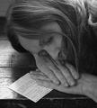
Dreaming of All That Wealthby loriprophotoComment: One takes huge risks photographing faces in shadow. I like the composition. I especially like the light; and the textures.the wood of the table, the hair and even the wrinkles and pores in the skin are nicely rendered. The shadow on the face seems just a little strong, even though the subject is sleeping. |
| Photographer found comment helpful. |
| 08/05/2005 11:43:32 PM |
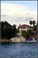
"Doc's Dock"by sfarrell23Comment: Daring and provocative use of negative space. I love this photo because it is one of the best lessons I've had here in the use of negative space since a string of tiny cow shots several months ago. Nice job. |
| Photographer found comment helpful. |
| 08/05/2005 11:40:08 PM |
|
| Photographer found comment helpful. |
| 08/05/2005 11:39:28 PM |
Golden Viewby mikalaComment: Why does this make me think of that old song in such a subversive way, I wonder? "Ferrarri .. Oh oh oh oh .... Campari oh oh oh oh." That it does earns you an extra point; though I hate the song - it always struck me as having something to do with gratuitous consumption and waste of wealth.
Oh yes, the photo. The way the reflectons underscore the name make the photo. Very understated. Very nice. |
| Photographer found comment helpful. |
| 08/05/2005 11:27:51 PM |
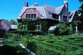
The Little House in the Countryby sbeaumontComment: My summer cottage. You've found my summer cottage. And I had just about forgotten about it!
Curious. I've seen so many photos of England in fog and diffuse light that seeing a house like this in direct, undiffused light makes it seem somehow wrong - as if the house and its gardens had some how been transported for the day just to be photographed beneath the blazing north African skies.
The sky seems just a tad too aqua or green. And so do the bricks. Come to think of it, that lovely green hedge - I bet it is that color when the sky is cloudy but i'd not be surprised if it were considerably more yellow in bright light.
Not sure how to make the composition better, but it somehow seems unbalanced. If the photo is about the house, I'd like that to take up more space. If it is about the grounds, I'd like their features to be more pronounced, more distinct. |
| Photographer found comment helpful. |
Home -
Challenges -
Community -
League -
Photos -
Cameras -
Lenses -
Learn -
Help -
Terms of Use -
Privacy -
Top ^
DPChallenge, and website content and design, Copyright © 2001-2025 Challenging Technologies, LLC.
All digital photo copyrights belong to the photographers and may not be used without permission.
Current Server Time: 08/04/2025 02:48:57 PM EDT.