| Image |
Comment |
| 08/10/2005 10:08:58 PM |
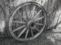
1886by chadbComment: I love the textures of the wood and grass. And I love the shape of the wheel. There is a kind of emptiness to the photo which causes it to grow uninteresting fairly quickly. |
 Photographer found comment helpful. Photographer found comment helpful. |
| 08/10/2005 10:06:47 PM |
1880by greslizzzComment: I notice that the grass is mowed in a direction parallel to the wooden bench. |
| Photographer found comment helpful. |
| 08/10/2005 10:05:54 PM |
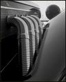
nineteen-thirty-eightby bikefreakComment: Wow. The composition is super and so are the other technical details (mostly.) I even like the frame. Very nice.
Not sure what the editing rules were for the challenge, but I do wish those lines in the background were gone - the paucity of detail in the subject tempts the eye to wonder off to malinger on those insignificant details. |
| Photographer found comment helpful. |
| 08/10/2005 10:02:42 PM |
1900 an entire centuryby Luifer_9d9Comment: It's a nice choice of subject - great pose. Not clear why so much negative space above the subject's head - especially the shiny white water that distracts us from the subject. I'd have liked to see just a bit more highlight in the subject's face. |
| Photographer found comment helpful. |
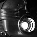
| 08/10/2005 09:57:53 PM |
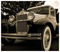
1930by oOWonderBreadOoComment: Nice subject, nice perspective, nice choice to present in sepia.
Quibbles: There is more fuzziness in parts of the car than one would expect from such a short lens; and while this level of sharpness might be the perfect thing in other formums or media, the photo is, IMO, unsharp by the conventions of this site. |
| Photographer found comment helpful. |
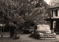
| 08/10/2005 09:53:56 PM |
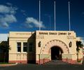
1930, When smoking improved your healthby tasha4pawsComment: The subject is quite photogenic and it produces a very strong sense of place. Nice colors. There is an attempt to square everything with the frame which is only partially effective. And even if it had been successful, I wonder if there had not been some more interesting or dynamic treatment of the building. |
| 08/10/2005 09:44:11 PM |
|
| Photographer found comment helpful. |
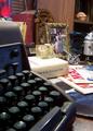
| 08/10/2005 09:43:25 PM |
1968by codauberComment: The assemblage of items is strongly evocative of the era. There is something about the white light that seems a little harsh and inappropriate for a 'vintage' feel. The white book manages to steal the show because of its light color interacts with the lighting. This is unfortunate because I am much more interested in the typewriter, the model spacecraft, the gyroscope the radio and the photo. |
| Photographer found comment helpful. |
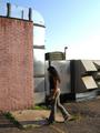
| 08/10/2005 09:38:58 PM |
time capsule for 2005by jennseeComment: Not clear about what makes this distinctively 2005. For instance, those Keds, long hair, and bell bottoms would fit late seventies also. The placement of the subject seems a little haphazard, I think there might have been post processing treatments that would have transformed the looming ductwork and the brickwork into something more interesting. |
| 08/10/2005 09:33:07 PM |
|
Home -
Challenges -
Community -
League -
Photos -
Cameras -
Lenses -
Learn -
Help -
Terms of Use -
Privacy -
Top ^
DPChallenge, and website content and design, Copyright © 2001-2025 Challenging Technologies, LLC.
All digital photo copyrights belong to the photographers and may not be used without permission.
Current Server Time: 08/04/2025 02:48:57 PM EDT.