| Image |
Comment |
| 12/21/2006 12:32:20 PM |
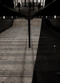
Goodbye Blue Skyby jjbeguinComment: I'm confused about the black on the righthand side. Also, the darks are very dark and you lose definition towards the bottom of the stairs, which may have been what you were going for, but since you can see detail again beyond that point it wasn't all that effective. If you were implying loss of detail as you go down it might have been best to crop while in the dark part at the bottom. |
 Photographer found comment helpful. Photographer found comment helpful. |
| 12/21/2006 12:30:21 PM |
|
| 12/21/2006 12:29:23 PM |
|
| Photographer found comment helpful. |
| 12/21/2006 12:28:31 PM |
|
| Photographer found comment helpful. |
| 12/21/2006 12:28:17 PM |
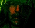
The lunatic is in my head!by graphicfunkComment: I like the idea a lot, however, I find the shirt/sweatshirt to be a distracting outfit choice - better to just do a plain (maybe ripped) t-shirt. Also, I'm not sure how you made the light patterns, but they're overlapping with the model and despite the name, it's very unclear at first glance that the black is a head shape. |
| Photographer found comment helpful. |
| 12/21/2006 12:25:25 PM |
"Flaming" 1967by snaelandComment: A little too dark - or at least, contrast is too high. It's a problem with flames. |
| 12/21/2006 12:24:01 PM |
...two lost souls Swimming in a fishbowl...by xianartComment: I like this idea, but I think it would have been more effective with a different backdrop and if you could have seen more of the fishbowl. There are also distracting dots, maybe bubbles, in the foreground and droplets of water inside the top of the bowl. |
| Photographer found comment helpful. |
| 12/21/2006 12:22:39 PM |
|
| 12/21/2006 12:21:35 PM |
|
| 12/21/2006 12:20:46 PM |
|
| Photographer found comment helpful. |
Home -
Challenges -
Community -
League -
Photos -
Cameras -
Lenses -
Learn -
Help -
Terms of Use -
Privacy -
Top ^
DPChallenge, and website content and design, Copyright © 2001-2025 Challenging Technologies, LLC.
All digital photo copyrights belong to the photographers and may not be used without permission.
Current Server Time: 09/04/2025 12:30:24 PM EDT.