| Image |
Comment |
| 08/22/2003 07:36:06 PM |
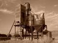
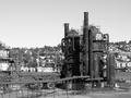
Remnantby pncowleyComment: good use of the sepia. maybe better with less DOF so the background would be a little blurry , but maybe your camera does not allow it. |
 Photographer found comment helpful. Photographer found comment helpful. |
| 08/22/2003 07:34:58 PM |
|
| Photographer found comment helpful. |
| 08/22/2003 07:33:24 PM |
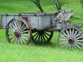
Transportby amsmythComment: If you have almost 100%% of it .. then you should have it fully in the frame/ bottom part of the picture looks empty
|
| Photographer found comment helpful. |
| 08/22/2003 07:32:24 PM |
|
| Photographer found comment helpful. |
| 08/22/2003 07:28:25 PM |
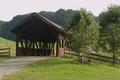
1956by ttreitComment: photo is way too busy and crowded. Depth of field control would help or a closer shot |
| Photographer found comment helpful. |
| 08/22/2003 07:26:37 PM |
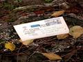
old letter on an old stumpby kenboComment: You should have lower the letter in the frame. Other than that I think the 'setup' should be better. It looks like the letter has been dropped there for the picture. |
| Photographer found comment helpful. |
| 08/22/2003 07:23:23 PM |
|
| Photographer found comment helpful. |
| 07/07/2003 06:44:28 PM |
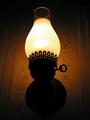
The Lock of Passionby paganiniComment: Nice colors and textures. A lot of different textures I like it.
The upper part look empty to me, with the lock going down the 'dynamic' is toward the bottom. you should have frame it differently in my opinion.
Link to the challenge a little weak I think. Without the title the only question is 'what's behind' and I do not see that much how the title relate to the shot. |
| Photographer found comment helpful. |
| 07/07/2003 06:39:31 PM |
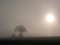
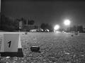
long nightby freeride21aComment: Nice shot. Grain is nice. I have been wondering if it would have been better without the 'horizon' line in the middle. I am not sure. the little pb on the left is dragging my eyes there. If you want the one park .. you get the thing in the upper left corner. Nice night B&W shot. 7. Lionel |
| Photographer found comment helpful. |
| 06/22/2003 02:29:06 PM |
Self Portraitby Girl from OZComment: I like the agressivity and the 'voilence' in this picture. Plust the realisation is very good with the hair looking like jail bars (intended I guess). Nice and original. one of my preferred this week. Yellow on the face a little too 'blown out'. 8. Lionel |
| Photographer found comment helpful. |
Home -
Challenges -
Community -
League -
Photos -
Cameras -
Lenses -
Learn -
Help -
Terms of Use -
Privacy -
Top ^
DPChallenge, and website content and design, Copyright © 2001-2025 Challenging Technologies, LLC.
All digital photo copyrights belong to the photographers and may not be used without permission.
Current Server Time: 08/25/2025 10:30:30 PM EDT.