| Image |
Comment |
| 12/24/2002 01:18:27 AM |
So that We May Be Freeby YomiComment: I would not have frame the 'stick' of the flag' in front of the grave. Stil a nice shot. 7 Lionel |
 Photographer found comment helpful. Photographer found comment helpful. |
| 12/22/2002 08:01:23 PM |
Midnight Basketballby Wheeler1992Comment: Critique Club
INITIAL RESPONSE: Nice and not easy shot. Would have prefered a motion trail on the ball. Good light for a night shot well balanced. Bother bu the dysimetric cropping of the 'panel'.
COMPOSITION-CONTENT - That was not an easy shot ;-) I wonder how many times you tried it. Its a very nice stop motion shot. Very valid for the challenge even if I think most of the people would love to see a motion trail behing the ball.
Somehow I am distracted by the dysimetric amout of black above and below the 'basket panel' , I think in that case it would have been better to crop a little more at the bottom. Very nice angle.
CAMERA WORK-TECHNICAL- The light homogeneity all over the shot is impressive. It looks perfect to e. Depth of field is adequate.
DIGITAL PROCESSING - TECHNICAL - Nothing specific to say so .. perfect to me.
MY OPINION ON THE PHOTO - Almost everything said .. I like the shot, I would have shown more black above (I do not know what your original shot was). I would prefer that rather than to crop the bottom because I think the balck empty space does bring something.
Nice shot anyway ... and probably not an easy one. Congratulations.
Lionel
|
| 12/22/2002 07:42:41 PM |
Good Vibrationby Harz_JoergComment: Critique Club
INITIAL RESPONSE: Nice colors, Good Idea, Miss the hand playing them, empty lower right corner.
COMPOSITION-CONTENT - I like the content a lot, Light is nice with the 2 black parts like balancing each other. It seems to me that the lower right corner is a litle 'empty' whithout 'defining' the rest. I like the colors a lot the green and yellow/gold mix is very nice.
I like being able to see the texture of the wood.
CAMERA WORK-TECHNICAL- Good depth of field and exposure. I guess it was not easy to balance the light correctly.
DIGITAL PROCESSING - TECHNICAL - Nothing specific to say so .. perfect to me.
MY OPINION ON THE PHOTO - I like this photography and I think the colors and the angle , because unusual, are very nice. I like the color a lot. Looking at the picture I keep thinking like 'what make the string vibrates and keep wondering igf it would have been nice seeing the hand finishing the movement in the lower right part of the shot.
Anyway it's a nice shot. Congratulations.
Lionel
|
| Photographer found comment helpful. |
| 12/19/2002 07:19:36 PM |
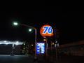
76 night shiftby KanedaComment: I like the tones and colors and contrast but youshould have framed differentl. The gas statio looks 'cut' and the black part on the right does not bring anythin and do not 'define' the rest of the picture. 5 |
| 12/19/2002 07:09:52 PM |
And He Created Colorby autoolComment: aahhhhhh I am torn .. I like the picture a lot ... but I keep seeing somebody mixing the colors in water or something to get that .. I cannot get the 'man' our of it in my head ... So I am giving it a 7 but would probably have give it momre in an other challenge. Very nice 'art' painting/photography. Lionel |
| 12/15/2002 08:28:32 PM |
Crystal Gazingby athenaComment: Critique Club
INITIAL RESPONSE: NIce textures, nice origamis, love the middle 'ball' .. composition could have been better .. all the lower 1/3 is empty.
COMPOSITION-CONTENT - I think you brought the right items for this composition . The ball is really very nice ... I think however they could have been placed better .... the picture looked 'unbalanced' with the liwer 1/3 of the picture empty. ALl the textures are very niceand the reflections well controlled (some but not too much).
BACKGROUND : Very good idea to have used the marble .. it 's nice and appropriate. However, there is already an ampty spce in the lower part of the picture, the white part of the marble does not help and add to this feeling.
CAMERA WORK-TECHNICAL- Good depth of field and exposure .. nothing special .. I think the light is nice .. some reflection but not too much.
DIGITAL PROCESSING - TECHNICAL - Nothing specific except some noise on the right 'bright' animal.
MY OPINION ON THE PHOTO - I usually do not like 'setup' when diferent objects or items are brought together to tell a story, except if they are already like this in the reality. In that case it did not bother me at all I am even attracted buy the composition and the story. However I think you could improved on the composition. I would retry the shot if you still have the items. And nice origamis by the way !
Lionel
|
| 12/15/2002 08:19:30 PM |
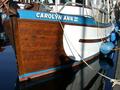
Blue Ladyby Digital_DeamonComment: Critique Club
INITIAL RESPONSE: Nice color, Feel like something is missing like you 'cut' the boat and .. ah hhh the shadow.
COMPOSITION-CONTENT - I think you should have shown more of the boat .. or less .. as it is it looks 'incomplete' like a part is missing. Very cluttered picture but still appealing I gues because we expect that for a boat in a port. The shadow is definitively a no and is very distracting.
BACKGROUND : As said above .. very busy background but justified, plus the eye can rest in the very nice still waters ..; the water is soo nice !!! Maybe you could have use only the water and a part of the boat.
CAMERA WORK-TECHNICAL- Very deep depth of field which think is good in that case, perfect exposure. I like the colors a lot they are very nice and natural.
DIGITAL PROCESSING - TECHNICAL - Nothing specific so ... good digital processing !!!!!
MY OPINION ON THE PHOTO - The boat and the weather condition you had had a great potential but I think it would have deserved a better composition (more of the boat or less of the boat) and a different angle to avoid the shadow. Do not be afraid to ay on the ground ... (not sure how the shot would have looked like but it woud have avoid the shadow).
Lionel
|
| 12/15/2002 07:56:04 PM |
Feeling Blueby Bill JonesComment: Critique Club
INITIAL RESPONSE: Quick spontaneus shot. Some blue. Technical flaws (composition)
COMPOSITION-CONTENT - The composition is not very good I think. as it is , it does not tell us anything. Too bad because the expression looks promising. If it is your originial idea of composition then it should show the the person in full or you might get closer. the picture is 'tilted' without bringing anything special. (see very good comment of derekleung about the composition of your shot)
BACKGROUND : Would have deserved to be more blurred as its not very interesting to 'detacht' the person more.
CAMERA WORK-TECHNICAL- It's probably a 'passing shot' (pun not intended) but it would have been really better if you could have had time to copose the shot better.
DIGITAL PROCESSING - TECHNICAL - Looks a little noisy and maybe oversharpen a little.
MY OPINION ON THE PHOTO - The person was a good candidate for a nice 'people shot' if you could have take your time. As it is I think it's a little 'missed' even if you had the eye to see the potential of this person.
Lionel
|
| 12/15/2002 06:19:15 PM |
Blue Rockets Over the Red Riverby goodtempoComment: Critique Club
INITIAL RESPONSE: Very nice fireworks shot .. nice colors, fit the challenge.
COMPOSITION-CONTENT - The composition is 'nice' but could be better .. I feel lilke missing something in the bottom because this is where the fireworks come from. Some marks in the upper right corner .. a little distracting but not too much. I like the whoe firewrks with it's different area I like the 'blue/purple' 'things' in the middle upper part.
BACKGROUND : nothing special except those marks .. maybe by adjusting the contrast or curves you could have get rifd of them .. but they do not bother me that much.
CAMERA WORK-TECHNICAL- Missed shot, shaky shot.
DIGITAL PROCESSING - TECHNICAL - GOod .. no specific comments. No visible jpeg artefact or noise.
MY OPINION ON THE PHOTO - I like the shot a lot... Think would have prefered it 'portrait' but maybe you original shot was like this. in tha case .. not that many thing you could have done at post processing/printing.Congratulations!
Lionel |
| Photographer found comment helpful. |
| 12/15/2002 05:59:37 PM |
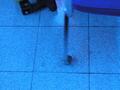
interesting...by heartsdivideComment: Critique Club
INITIAL RESPONSE: Do not know what it is. Not interesting except it's blue. a pretty missed shot.
COMPOSITION-CONTENT - Blurry/shaky. the items we see at the top left and top right do not bring anything and are disturbing. Had to comment without knowing what you tried to do. Nothing interesting. You could have tried maybe with the 'leg' only, more on the right and in focus.
BACKGROUND- Nothing specific, blurry, no interesting..
CAMERA WORK-TECHNICAL- Missed shot, shaky shot.
DIGITAL PROCESSING - TECHNICAL - no comment.
MY OPINION ON THE PHOTO - Sorry, I think the picture is totally missed. maybe you submited the wrong shot ? I do not know. Hard to comment in that case.
Lionel
|
Home -
Challenges -
Community -
League -
Photos -
Cameras -
Lenses -
Learn -
Help -
Terms of Use -
Privacy -
Top ^
DPChallenge, and website content and design, Copyright © 2001-2025 Challenging Technologies, LLC.
All digital photo copyrights belong to the photographers and may not be used without permission.
Current Server Time: 08/26/2025 02:47:21 PM EDT.