| Image |
Comment |
| 10/28/2002 07:57:00 AM |
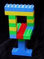
perceptionby falveyComment: Nice illusion. This one baffled me for a couple of moments until I noticed the width of the top piece compared with the width of the rest! Nice bright colours too! |
| 10/28/2002 05:10:00 AM |
Lighthouseby hilmarsigComment: The lighthouse is nearer to the right of the picture than the left. Nice photo but I'm afraid I can't see how it relates to the challenge. |
| 10/28/2002 06:25:00 AM |
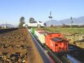
Little Rail Crossingby Garden WeaselComment: I like the idea, it made me laugh! I just hope you were sure that there wasn't a 'proper' train coming up behind you! The viewpoint is good but I wonder if there's too much sky? Maybe it should've been cropped level with the tops of the trees by the car. |
| 10/28/2002 06:17:00 AM |
Chrome Illusionby janfriesComment: The sky looks extremely over blown and harsh. The framing is off (the front of the car is nearer the edge of the picture than the left is). I'm not sure what's an illusion about this either, except for possibly the pearlescent paintwork on the car? |
 Photographer found comment helpful. Photographer found comment helpful. |
| 10/28/2002 06:21:00 AM |
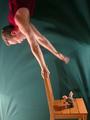
Balancing Actby kosmikkreeperComment: At first I thought it must have been upside down but now I'm not too sure (the toy on the chair is a good addition in this respect)! I'm going to go with upside down and the toy was fixed to the chair. The lighting being in the bottom left might give it away, why put your light on the floor?! Nice photo though, i like the movement in the hand to signify a bit of 'wobble' 8/10 |
| Photographer found comment helpful. |
| 10/28/2002 01:01:00 AM |
untitledby prodigal havocComment: Framing slightly off, would have been nice to see the top of the can (but that might be where the string/hand is!) I wonder why black & white was chosen though. |
| 10/28/2002 01:26:00 AM |
Realityby stephanComment: A bit dark but a good illusion, it certainly meets the challenge. |
| Photographer found comment helpful. |
| 10/23/2002 08:15:00 AM |
|
| 10/23/2002 10:52:00 AM |
Nature's Flameby TerryGeeComment: Strong colours. Would've liked to have seen it zoomed out a little and seen a bit more. |
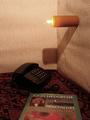
| 10/23/2002 10:39:00 AM |
Edison's Gift by stephanComment: Simple idea. Nice title. Good defintion and clarity. It's a shame the hands were slightly off centre and the right thumb is higher than the left. (But I appreciate that this is a photography site and not one for geometry!!!) 9/10 |
| Photographer found comment helpful. |
Home -
Challenges -
Community -
League -
Photos -
Cameras -
Lenses -
Learn -
Help -
Terms of Use -
Privacy -
Top ^
DPChallenge, and website content and design, Copyright © 2001-2025 Challenging Technologies, LLC.
All digital photo copyrights belong to the photographers and may not be used without permission.
Current Server Time: 08/21/2025 10:27:47 PM EDT.