| Image |
Comment |
| 04/23/2008 08:20:40 AM |
Venezia by naomikComment: Congratulations on the red ribbon. Great photo... deserved no less. |
 Photographer found comment helpful. Photographer found comment helpful. |
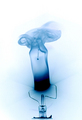
| 04/20/2008 10:26:40 AM |
Burnt Bulbby bruskiComment: Absolutely beautiful image. It has a depth to it which gives it a 3d quality. The contrast and clarity is perfect... can't fault this image at all... my favourite of the challenge. 10! |
| Photographer found comment helpful. |
| 04/09/2008 07:40:33 AM |
|
| Photographer found comment helpful. |
| 04/09/2008 07:32:39 AM |
|
| Photographer found comment helpful. |
| 04/09/2008 07:22:47 AM |
Whisperby belenComment: I like this... not sure why though... it's an ear. Think it's because it's such a simple photo, and it's done so well. Having it orientated as it is makes you stop to have a longer look at it... it's not the usual way of seeing an ear.
The details are good, as is the lighting... the hair is a bit distracting, though, that said, I think it wouldn't be as good if the hair was tucked behind the ear. The bottom left of the image is an issue, as it tends to unbalance the image.
Well done. |
| 04/09/2008 07:02:18 AM |
the roseby LoreComment: Nice details and use of DOF. Colour is a little flat though. With the shallow DOF, some tweaking of the red could have given this image some pop... a 3 dimensional quality. |
| 04/09/2008 06:59:36 AM |
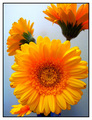
Centered Sunshineby missxmiseryComment: A very nice image... but I don't feel that this is a centred composition... the main flower/subject isn't centred vertically nor horizontally... and as far as the overall image goes, the other flowers don't offset the main flower enough to bring the composition back to the centre of the frame. Colour is brilliant and you've used the DOF well... just that balance issue which hurts this for this challenge. |
| Photographer found comment helpful. |
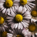
| 04/09/2008 06:54:27 AM |
Kamilleby mehrandj7Comment: Nice. I like the colours and the composition. There's a variety in the image thanks to the arrangement of flowers without compromising the theme... clever. Contrast is great, as is the focus... my only issue with this is the petals at the bottom sticking up and out of the field of focus. Other than that, love this photo. Well done. |
| 04/09/2008 06:51:27 AM |
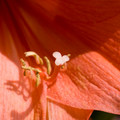
Stigma of Amarillisby kiskatComment: While the stigma is centred and in focus, there's not enough there to keep the interest long. The colour is nice and the focus is clear, however I think the image suffers b/c of the shallow DOF and a lack of balance (due to the bottom right section being in focus and best light. |
| Photographer found comment helpful. |
| 04/02/2008 07:34:19 PM |
Picking Colorsby JucaComment: This is a very warm photo... think you might have entered the wrong challenge. That aside, the focus is a little off and there's too much to look at and no obvious path for the viewers focus to follow. |
Home -
Challenges -
Community -
League -
Photos -
Cameras -
Lenses -
Learn -
Help -
Terms of Use -
Privacy -
Top ^
DPChallenge, and website content and design, Copyright © 2001-2025 Challenging Technologies, LLC.
All digital photo copyrights belong to the photographers and may not be used without permission.
Current Server Time: 08/04/2025 11:53:13 AM EDT.