| Image |
Comment |
| 02/04/2005 03:37:00 PM |
*by Moose101Comment: I can't wait to see how you did this. I'm thinking same lightbulb, long exposure. But it's so crisp. Very nice photo. |
 Photographer found comment helpful. Photographer found comment helpful. |
| 02/02/2005 03:40:04 PM |
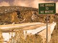
"nowhere"by real_ndnComment: something about the colors seem too pink, but otherwise very nice photo. i love the stop sign in the background..as if one had the choice. |
| 02/02/2005 03:38:33 PM |
|
| 02/02/2005 01:56:51 PM |
prediction2.jpgby alanfreedComment: stange! I'm watching this scene on the news right now! Looks like you had a front row seat. Nice shot! |
| Photographer found comment helpful. |
| 02/02/2005 01:52:50 PM |
SelfBWby GeocideComment: i just read in the forum what the black bar was for. oops! sorry ;) |
| Photographer found comment helpful. |
| 02/02/2005 01:51:38 PM |
SelfBWby GeocideComment: very nice cropping and lighting. (very nice looking, too!) The only thing i dont like is the black bar at the bottom. it seems distracting. if it was an entire border i think it would be better. But great photo! Did you use a remote or a timer? |
| Photographer found comment helpful. |
| 02/02/2005 01:42:34 PM |
"Please".....shareby HalimComment: the technique is interesting (was it done by zooming out on a long exposure?) but i don't see how it relates to what the sign says. If the sign said something like "watch for falling tress" that would have been more apt. Not bad though. |
| Photographer found comment helpful. |
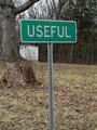
| 02/02/2005 01:39:31 PM |
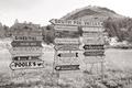
In This Town, Some Places Are More Than Useful!by nsmithComment: This is pretty funny! I would have liked it better if the sign was more to the left and you could see the outhouse a little better (but that tree would be in the way then). The first time I looked at this, i didn't notice the outhouse was there because the sign is the center of attention. If there was some way to make that stand out a little more, maybe. However, the subtlety is nice too. |
| Photographer found comment helpful. |
| 02/02/2005 01:36:01 PM |
Bible signby undieyatchComment: this sign is scary. i like the REPENT!!! feel of it. Quite ominous. But the saturation could have been brought out a bit to make it more powerful. |
| 02/02/2005 01:32:42 PM |
Pro-Lifeby vtruanComment: i think it would have been funny if you had some kids easter egg hunting in the background with a cop chasing after them. i guess i'm a little weird. Not a bad pic, just not that interesting. nice scenery thought. |
| Photographer found comment helpful. |
Home -
Challenges -
Community -
League -
Photos -
Cameras -
Lenses -
Learn -
Help -
Terms of Use -
Privacy -
Top ^
DPChallenge, and website content and design, Copyright © 2001-2025 Challenging Technologies, LLC.
All digital photo copyrights belong to the photographers and may not be used without permission.
Current Server Time: 08/23/2025 03:53:27 PM EDT.