| Author | Thread |
Comments Made During the Challenge  |
|
|
02/07/2005 10:30:32 PM |
|
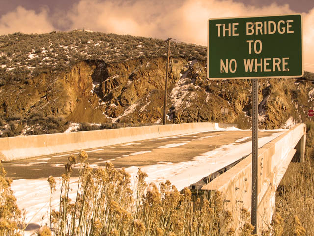
Interesting! I like the shot and the ontes, except by the snow in the foreground. And is that a real sign? If so, they need a dictionary. |
|
 Photographer found comment helpful. Photographer found comment helpful. |
|
|
02/07/2005 04:53:53 PM |
|
The low angle actually makes it look like the bridge ends in the rocks. The bridge gives perspective and leads the ege to the sign. Very interesting |
|
| Photographer found comment helpful. |
|
|
02/07/2005 09:50:42 AM |
|
| Photographer found comment helpful. |
|
|
02/05/2005 10:28:19 PM |
|
| Photographer found comment helpful. |
|
|
02/05/2005 04:15:19 PM |
|
We have one of these. Up the Whanganui river, the bush has taken it over now' I like thi shot it certainly goes nowhere |
|
| Photographer found comment helpful. |
|
|
02/05/2005 08:41:16 AM |
|
I'm not sure that I like the colour treatment here. A touch too yellow perhaps? |
|
|
|
02/04/2005 11:49:12 PM |
|
I think the coloring in this picture does your entry harm in this challenge. The green of the sign needs to be bold and jump out at the viewer. |
|
|
|
02/03/2005 05:34:36 PM |
The washed out colors work well in this shot. I'd like a little more sky, but the picture works.
|
|
| Photographer found comment helpful. |
|
|
02/03/2005 12:42:21 PM |
|
Well, my goodness, that's not something to brag about, is it! Great find. The stop sign at the end of the bridge might be a candidate for the next one of these challenges. I like the low-key approach you took to this composition. |
|
|
|
02/03/2005 09:46:54 AM |
|
Certainly looks like it!! nice shot |
|
|
|
02/02/2005 11:05:51 PM |
|
There is a stop sign at the end of the bridge to nowhere. What a cool shot!! |
|
|
|
02/02/2005 09:01:29 PM |
|
I like the color or lack of color. Good humor, too. |
|
|
|
02/02/2005 05:15:45 PM |
|
|
|
02/02/2005 03:40:04 PM |
|
something about the colors seem too pink, but otherwise very nice photo. i love the stop sign in the background..as if one had the choice. |
|
|
|
02/02/2005 03:36:30 PM |
|
It's hard to see the stop sign at the end of the bridge... Being able to see both clearly makes it a more clever shot. 7 |
|
|
|
02/02/2005 03:25:54 PM |
|
|
|
02/02/2005 02:23:09 PM |
|
Good sign find. I can't figure out why the red cast. |
|
|
|
02/02/2005 11:01:39 AM |
I actually goes to a place! It goes down!
Really good one |
|
|
|
02/02/2005 10:24:17 AM |
|
Love the colorized look-10 |
|
|
|
02/02/2005 09:36:29 AM |
|
|
|
02/02/2005 09:12:38 AM |
|
not sure about the contrast |
|
|
|
02/02/2005 07:37:09 AM |
|
Nice sign but whats up with the color??? It almost seems like a sepia tone but isn't. I also find the clarity to be a little OoF. Good luck in this challenge. |
|
Home -
Challenges -
Community -
League -
Photos -
Cameras -
Lenses -
Learn -
Help -
Terms of Use -
Privacy -
Top ^
DPChallenge, and website content and design, Copyright © 2001-2026 Challenging Technologies, LLC.
All digital photo copyrights belong to the photographers and may not be used without permission.
Current Server Time: 07/01/2026 05:42:43 AM EDT.