| Image |
Comment |
| 04/10/2005 11:14:06 AM |
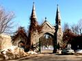
GATES TO HEAVEN (OR HELL)by joansuzyComment: *Critique Club*
Like I said in the comment during voting. First thing is the car takes a lot away from this image. Now that I have looked at it a little longer I would say it would be better if you would have gotten in a little closer to show the detail in the stone and the iron gates. Being this far away leaves my eye wandering all over for something to fixate on. Also getting closer would get rid of the shadows from the trees that are on the road. I find the shadows almost as distracting as the car. As far as color goes you have a nice blue sky and some good red tones in the leaves around the stone. The red is hurt by the shadowing on the right. It is in good focus. The photo is a bit too small. You can submit up to 640 pixels or 150kb and you should utilize every bit of that. Read the tutorial on "Using Photoshop to Prepare Photos for DPC Challenges" if you haven't yet. You can find it here //www.dpchallenge.com/tutorial.php?TUTORIAL_ID=26
What I would have done to improve this is to get in closer and make the gate with the stone columns my main subject and point of focus. You have a good idea and with a little work you can greatly improve this. Maybe even go back on a day where there is a few more clouds in the sky and maybe around sunrise or sunset. Usually at these times you can get some wonderful yellows, reds, oranges, and blues in the sky and that would greatly improve your subject.
I look forward to seeing more of your work. |
| 04/08/2005 08:15:31 PM |
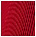
Red Lines 2by ShannonComment: You have given me a hard one to comment on. I normally don't like abstracts but this one looks good. I like how you have set the lines kinda at a slight diagonal. It is a very bright color. I also like the border. To me it offsets the red in a good way. Job well done. |
 Photographer found comment helpful. Photographer found comment helpful. |
| 04/03/2005 04:01:57 PM |
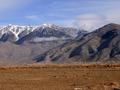
King_Mountain.jpgby BAMartinComment: Although you have probably heard it before the horizon needs to be straightened. I would crop some of the foreground not all. You have a wonderful image with a nice cloud formation to look at and some nice mountains. Good work. |
| Photographer found comment helpful. |
| 04/03/2005 03:58:33 PM |
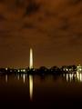
Night on the Tital Basinby BAMartinComment: Great shot. I love the clouds in this. The horizon look a little unlevel but it doesn't take away from the photo. I thin it is beautiful with the colors and reflections. Everything works for me. |
| Photographer found comment helpful. |
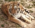
| 04/03/2005 03:52:18 PM |
Chunga II.jpgby pumaComment: Nice closeup. I love the eyes. I wonder how you got this shot. From what I hear it is hard to get cats to sit still long enough. She (He) has that look of trying to figure out what you are holding. |
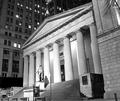
| 04/01/2005 08:17:45 PM |
Federal Hallby RulerZigzagComment: I would say crop a little more off the right to get rid of the window and that part of the pole on the bottom. It is a good photo and in my opinion your best yet. This really looks good b/w and has a nice composition. I don't think it would look as goos straight. Good work Tony. |
| Photographer found comment helpful. |
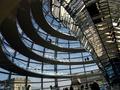
| 04/01/2005 11:42:52 AM |
round.jpgby asijComment: I kinda find myself lost in this shot. I don't really know which way to look. I think there is just too much in this to really see what you are trying to show. I think it would be better if you cropped it like you suggested in the thread. I would be less busy. |
| Photographer found comment helpful. |
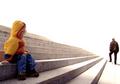
| 04/01/2005 11:40:39 AM |
troppum.jpgby asijComment: I like it. I think you could make it a lot better with some cropping. I would crop about half of the photo out. Half of the right I should say. The background is just too bright for me. The pov on the kid is excellent though. Try to crop it like I suggested then look at it. If you don't like it then fine. I think it would make a marvelous print if you done that. It would give a sense of lonliness. You have a good eye and frame your subject well. Message edited by author 2005-04-01 11:43:16. |
| Photographer found comment helpful. |
| 04/01/2005 09:57:33 AM |
Leoby tristaliskComment: By far my favorite of the three you asked for comments on. The only thing I would change is to bump the green up a little in Photoshop to give it that extra punch. You have done a good job framing the subject and no big distractions in this one. Nice work. |
| Photographer found comment helpful. |
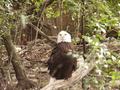
| 04/01/2005 09:55:40 AM |
Prideby tristaliskComment: A little to busy for my liking. It would probably of been too hard to get somewhere away from all the trees to photo the eagle. The tree leaves crossing in front of the bird are very distracting and there is one spot that looks blurry on the left side of the eagle from his tail. This is probably a twig. If you have Photoshop try to clone out that twig and it will greatly improve this. Maybe next time you get a chance to reshoot this then try to zoom in more and get the detail of the feathers. Maybe even get close enough to get just half of his body in the photo. You can even crop this one to do that. |
| Photographer found comment helpful. |
Home -
Challenges -
Community -
League -
Photos -
Cameras -
Lenses -
Learn -
Help -
Terms of Use -
Privacy -
Top ^
DPChallenge, and website content and design, Copyright © 2001-2025 Challenging Technologies, LLC.
All digital photo copyrights belong to the photographers and may not be used without permission.
Current Server Time: 08/14/2025 10:11:27 PM EDT.