| Image |
Comment |
| 10/14/2005 11:40:35 AM |
yellowby crystaldmComment: That yellow really does pop out at me and that is good. I think it would look better if you used the rule of thirds but either way it is a great start to a portfolio. Great image thanks for sharing. |
 Photographer found comment helpful. Photographer found comment helpful. |
| 10/06/2005 08:20:11 PM |
Floatby jaxedComment: What an excellent image. I really love how everything is in good focus that is supposed to be. Spot on with the drops. The green and red have punch also and that is great. The only thing I don't like is the border. It tends to get lost over on the right side of your image. I think a hair thin white border then the black would make this photo a perfect 10 for me. |
| Photographer found comment helpful. |
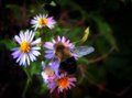
| 10/05/2005 02:27:01 PM |
Gothic Beeby jessirooComment: OH MY GOD!!!!!!
Momma is gettin her butt whooped......................what a great image. |
| Photographer found comment helpful. |
| 10/04/2005 08:53:25 PM |
ground.jpg.jpgby militarygirl10Comment: My critique as promised:
The selective desaturation is done real good here. She appears to be sad for some reason and I am nt sure if that is what you are trying to convey. Focus looks good and so does the DOF and colors. Two things I dislike are the piece of lint on the pants on the left. If you entered this in a member challenge then you could clone that out and stay withing the rules.
I don't know if this was posed or a candid but either way the pattern on the pants to the right is very distracting. I think by desaturating them you took more attention away from them and onto the girl which is good but the pattern is still a little distracting. I really like how the border kinda fades. Job well done IMO and I would have given you an 8 at least.
|
| Photographer found comment helpful. |
| 10/03/2005 07:18:17 PM |
Cheeseby jessirooComment: Killer portrait.....I like the soft focus on this. Try and get rid of the sidewalk behind her and make it grass also. I am sure your mom knows how to do that but you probably know more than her so give it a try. Enjoy the membership and keep on taking photos. Message edited by author 2005-10-03 19:18:38. |
| Photographer found comment helpful. |
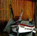
| 10/03/2005 07:11:13 PM |
Maritime Museum - Marylandby ChinabunComment: I think maybe too busy. Maybe focus on one particular item in the photo or show the whole trailer. I think by showing the whole subject it would do much better. The red is a nice bright color to attract my attention and the number 1924 on the boat is kinda intriquing though. IS that the year? It is a nice quality photo. Nothing wrong with the DOF or focus IMO. With a better crop I think it would improve it though. I just think it lacks that certain punch. Hope this helps and good luck. I give you a 7 |
| Photographer found comment helpful. |
| 10/03/2005 04:24:38 PM |
My Secret Gardenby JaimesonComment: Very nice and dreamy photo. I love the reflection. Only thing I would change is to clone out the specs in the water. Top 10 for sure.....if it were up to me top 3 |
| Photographer found comment helpful. |
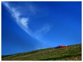
| 10/01/2005 09:51:46 AM |
My Own Slice of Heavenby RikkiComment: I love the simplicity of this. The red also stands out great. What a relaxing feeling this photo gives me. Only thing I would try is to bump up the green saturation a little to make the grass pop a little more.
Great photo. |
| Photographer found comment helpful. |
| 09/28/2005 10:43:07 AM |
Marigolds at Duskby Buckeye_FanComment: The lighting seems a little harsh. Also the orange in the background on the right really distracts me also. On the lighting situation on the left it is kinda dark elsewhere it is not. To me that is very distracting. Not much detail there in the flowers as I would like to see. Also if you use Photoshop make the image larger. What will hurts you more than anything in any challenge is having an image too small. If I had a chance to shoot this I would try to get into a postion to only get one flower in the shot as I feel it would have more punch. |
| Photographer found comment helpful. |
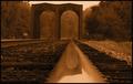
| 09/28/2005 09:37:16 AM |
The Perspective of a Railroad Wheelby Buckeye_FanComment: Nice tones in this shot. What I think hurt you was the image seems a little dark and is slightly tilted to the left. Also the black border is lost in the image. I would have put a thin white border then the black border just to seperate it from the image. |
| Photographer found comment helpful. |
Home -
Challenges -
Community -
League -
Photos -
Cameras -
Lenses -
Learn -
Help -
Terms of Use -
Privacy -
Top ^
DPChallenge, and website content and design, Copyright © 2001-2025 Challenging Technologies, LLC.
All digital photo copyrights belong to the photographers and may not be used without permission.
Current Server Time: 08/09/2025 05:05:07 PM EDT.