| Image |
Comment |
| 02/10/2006 10:04:32 AM |
Broken Artifactsby apprenticeComment: Hi. I think that a plainer background would help this shot. The background is too busy IMO, and takes away the focus from the artifacts for me. |
| 02/10/2006 10:01:47 AM |
Childhood Lostby fadedbeautyComment: Hi. A lot of creepy doll photos. The lighting here is great, and the red background emphasizes the mood! |
 Photographer found comment helpful. Photographer found comment helpful. |
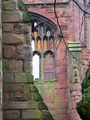
| 02/10/2006 10:01:04 AM |
Windows of the Damaged Soul?by obsidianComment: Hi. Nice colors here. As I look at the photo, I almost wish more of the background were visible (not sure if that was possible). My eye was initially drawn more to the foreground. |
| Photographer found comment helpful. |
| 02/10/2006 09:59:41 AM |
Cedar Fire Dogby LeejpComment: Hi. I see what you are going for here, but IMO the picture seems a bit busy. Maybe getting closer to the subject could help. |
| 02/10/2006 09:58:55 AM |
J. WOODSby seracComment: Hi. I like the idea, but the shadows seem to hide the subject a bit (I know it's tough to position the sun...). The focus seems a bit soft also. |
| Photographer found comment helpful. |
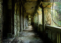
| 02/10/2006 09:56:46 AM |
|
| Photographer found comment helpful. |
| 02/10/2006 09:55:48 AM |
yum?by jdjhammerComment: Hi. I love the colors here, but I'm not as fond of the angle. It's a little too skewed for my taste. |
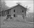
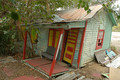
| 02/10/2006 09:55:03 AM |
Barnby bowhennComment: Hi. I like the mood of the picture - B&W does it well. IMO it could use a bit more contrast. |
| Photographer found comment helpful. |
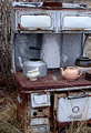
| 02/10/2006 09:52:11 AM |
The Monarchby linda12201Comment: Hi. I really like the texture and colors here. The two smaller teapots seem out of place (because they look so new). |
| Photographer found comment helpful. |
| 02/10/2006 09:51:20 AM |
Missed a Spotby yakatmeComment: Hi. Great colors here. The trees make it a little too busy for my taste. |
| Photographer found comment helpful. |
Home -
Challenges -
Community -
League -
Photos -
Cameras -
Lenses -
Learn -
Help -
Terms of Use -
Privacy -
Top ^
DPChallenge, and website content and design, Copyright © 2001-2025 Challenging Technologies, LLC.
All digital photo copyrights belong to the photographers and may not be used without permission.
Current Server Time: 08/03/2025 02:07:22 AM EDT.