| Author | Thread |
Comments Made During the Challenge  |
|
|
02/14/2006 05:38:43 PM |
|
I like the composition, but the image feels a bit overexposed. Maybe a bit of levels adjustment would help? |
|
 Photographer found comment helpful. Photographer found comment helpful. |
|
|
02/13/2006 09:59:46 PM |
|
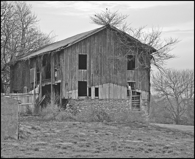
has an "Amityville Horror" look to it |
|
| Photographer found comment helpful. |
|
|
02/13/2006 07:49:06 PM |
|
Your photograph lacks in contrast very flat. The processing does very little to bring out the subject. I would suggest more contrast. I wish you the best in this and future challenges. |
|
| Photographer found comment helpful. |
|
|
02/10/2006 11:22:08 AM |
|
Maybe a closeup would be better. |
|
| Photographer found comment helpful. |
|
|
02/10/2006 09:55:03 AM |
|
Hi. I like the mood of the picture - B&W does it well. IMO it could use a bit more contrast. |
|
| Photographer found comment helpful. |
|
|
02/09/2006 08:23:50 PM |
|
Wow .. another black and white.. would like to have seen some colour here :) |
|
| Photographer found comment helpful. |
|
|
02/09/2006 01:34:02 PM |
|
Try backing out a little more on the next shot like this and let the wintery background add to the desolate / broke look to the building. Good work. |
|
| Photographer found comment helpful. |
|
|
02/08/2006 12:17:47 PM |
|
The lack of contrast in the image makes it look almost antique, very neat effect! |
|
| Photographer found comment helpful. |
|
|
02/08/2006 10:18:06 AM |
|
i like the subject, but somehow the detail and contrast seems flat. there's some wonderful details on the left side of building and perhaps exploring various close-up angles with strong light/shadow would really enhance this. the grass in foreground also has good detail/contrast potential. focusing on the 2 birds with groping branches attached to the upper-right side with window hole tells a story of its own. the overcast sky should not compromise good contrast. great potential here. |
|
| Photographer found comment helpful. |
|
|
02/08/2006 01:42:59 AM |
|
Nice idea. I think it's screaming for post editing. Could use some curves or levels in my opinion - to realy show off the texture of the stone and the boards. |
|
| Photographer found comment helpful. |
Home -
Challenges -
Community -
League -
Photos -
Cameras -
Lenses -
Learn -
Help -
Terms of Use -
Privacy -
Top ^
DPChallenge, and website content and design, Copyright © 2001-2026 Challenging Technologies, LLC.
All digital photo copyrights belong to the photographers and may not be used without permission.
Current Server Time: 06/28/2026 11:37:54 PM EDT.