|
|
| Image |
Comment |
| 01/03/2005 06:34:50 PM | Meg and Scrappyby blancericComment: The element that stands out strongest is Meg's fingers, which I find distracting. It would be nice to see Meg's face, as her name is in the title, so I think she should have as much exposure as Scrappy. Another distracting element that stands out is Meg's nose, in sharpeer focus than her cheek, and it's placed in a position of prominence in the fame.
Scrappy's head stands out nicely against the blurred should, but I think some color contrast correction are necessary to make Scrappy's fur stand out.
The amount of unfocussed, blank wall on the left gives this an unbalanced feel, for me. Perhaps crop this to a portrait layout by editing out all but a sliver of that wall?
I'm sorry to be blunt, but this basically has the feel of a hastily composed snapshot. |
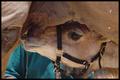
| 01/03/2005 03:03:37 PM | Camel Jockeyby TerramarComment: A cute shot, but it has several distractions. The eye is drawn to the bright spot in the upper right corner, and the specks of sawdust are also bothersome. A little dodging could remove those distractions.
|
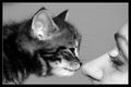
| 01/03/2005 02:55:54 PM | Wanna fight? by NazgulComment: An excellent image. Perfect exposure, focus and great detail. The eye contact between the two holds the viewer's attention nicely. My one nit is the hair in the young lady's face, but manipulating it out might cause more problems than leaving it in.
Nice expression on the cat, although I'm ot sure it matches the title. |  Photographer found comment helpful. Photographer found comment helpful. |
| 01/03/2005 09:59:22 AM | Cat welcomes ownerby LastgudComment: Lastgud
Well, Ivve been to Norway and had a layover in Reykjavik, but I've never seen a Norwegian forest cat. Sounds ferocious *grin*.
You set yourself a difficult task: a handheld self-portrait with an active cat and an on-camera flash.
The crop and the manner in which the cat frames your face is nice, but the cat's face isn't visible, plus his head and paw are blurred from motion. I think, with editing, it could become a decent photograph, but as is, it's just a snapshot (apologies if I seem too direct). There's a loss of detail in the highlights, and the yellowish cast doesn't work, imo, against the redness in your face and it turns the green of the shirt a alightly sickly hue. The glare above the head is distracting. These could be corrected to a degree.
As a B&W image, these difficulties would be eliminated and I think, by tweaking the contrast, you would come out with a successful image.
Just my thoughts, of course.
| | Photographer found comment helpful. |
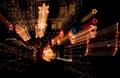
| 01/02/2005 06:26:23 PM | XXXmmmaaasssby hughletherenComment: hugh
A very interesting shot! Just enough hint of the house behind the decorations, and a well placed main interest point on the lower star.
Two thoughts come to mind.
My attention keps getting pulled to the far right by the 'Santa on a rope (?)', and it's a bit of an effort to push it back towards the middle of the image. Have you considered dodging or cropping it out?
Taking into account differences in monitors (though I calibrate mine, and suspect you do also from the quality of images I've seen from you), I could stand a little more saturation on the central decorations: not enough to overpower the star, mind you, just enough to make those colors a bit more festive.
Just my thoughts, of course.
HNY |
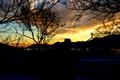
| 01/02/2005 06:15:52 PM | Decoration of the Natureby hgardComment: hgard
Beautiful colors in the sky, and nice use of the branches as framing - very crisp.
Two thoughts come to mind for improvement.
One, the cross could have been a bit better postioned to the left, to make use of the arch frame of the branches. Your ability to position yourself may have been limited, of course.
Secondly, I think the sky would be nicely complemented if you brought out the detail a bit in the lower half of the photo. Not too much to compete with the sky, but give enough detail for the viewer's eye to linger there a bit: brighten the windows and the lower blues a bit.
There may, of course, be differences in our monitors, and these are just my opinions.
I look forward to seeing more of your work.
|
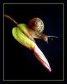
| 01/01/2005 08:18:54 PM | Over The Top (berenyi) And down the slideby trainComment: This is absolutely delightful! The subtle coloring, angle and quality of the lighting, composition. I'm almost speechless, and my friends will tell you that's quite an accomplishment *grin*
My one suggestion would be to dodge the stem to black right where it touches the edge of the frame. Not very thickly, just enough to place a thin line of black there to stop the viewers eye from following the stem out of the frame. The black 'break' will force the eye to stop, and the proceed back down to the flower, where yo want it to be.
I certainly hope you have this one up for sale.
Kudos. | | Photographer found comment helpful. |
| 01/01/2005 08:12:10 PM | Poinsettia 2by banmornComment: banmorn
I like the composition, but I think it lacks the sparkle it could have.
The contrast needs to be increased to make the darkest shadows pure black, and to make the small specular lights on the water drop white. The increased contrast will bring out the detail of the petals, ans make the pistils/stamens jump out of the image a bit more. The effect could be enhanced by saturating the yellows a bit. These can be done in Photoshop or other igital darkroom programs.
A lot of this effect could have been enhanced in-camera by opening up the shutter a half to a full stop. Rule of thumb: film or digital, an over-exposure will add snap to the finished image. If nothing else, bracket your exposures to a half under and a full stop over what you think the correct exposure should be. Eventually, you'll get a feel for how your camera handles the exposures.
This rule of thumb has one weakness: If you have highlights that you want to maintain detail in, overexposing will wash them out. Bracketing is still an excellent idea. We used to say 'Film's cheap,' but a digital file is even cheaper! *grin*
Just my opinions, of course. |
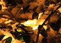
| 01/01/2005 07:59:41 PM | Warmth of First Snowby sannokComment: sannok
I like the warmth created by the color shift. The patterns created by the branches and leaves also add interesting detail to the overall piece.
WHere this fails, imo, is the lack of a define subject - or main point of interest, if you will. The point near the light is obviously intended as such, and that's where the eye is initially drawn because of the high contrast there, but I can't define what the object is (the shape doesn't stand out sufficiently}, so we have a background with a highlight, but no discernable subject. Lacking that, it's kind of neat, but fails overall.
Just my opinion, of course. | | Photographer found comment helpful. |
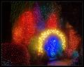
| 01/01/2005 07:50:52 PM | Christmas Magicby KonadorComment: Konagor
Technically, an excellent image. Nicely exposed, held just long enough to paint paint some of of the branches with detail but not so long as to wash out the colors.
I think my one nit would be in the composition - the placement of the doorway. It faces out of the frame, and combined with the walk, tends to lead the eye out of the image. It's an uncomfortable feeling. Like a person looking out of a frame, and the viewer not knowing what's there. It can be powerful if that's what the artist intended, but I'm not sure it was your intent here. Apologies if I'm incorrect.
As lovely as the colors are, they are only one element of the composition. They grab the viewer's eye. I think if the blue had been placed in the upper left third of the frame, approximately where the large patch of red lights are, the door and walk would pull the eye towards the middle of the frame.
Unless this is a close crop, it would mean reshooting the frame. I can't tell what is to the left and bottom, outside of the frame, but I think if it were more lights or if just faded to black, it would be a more pleasing composition.
If have the time to reshoot it, I'd be very interested in seeeing the results.
Just my opinion, of course. | | Photographer found comment helpful. |
Home -
Challenges -
Community -
League -
Photos -
Cameras -
Lenses -
Learn -
Help -
Terms of Use -
Privacy -
Top ^
DPChallenge, and website content and design, Copyright © 2001-2025 Challenging Technologies, LLC.
All digital photo copyrights belong to the photographers and may not be used without permission.
Current Server Time: 08/02/2025 06:09:42 PM EDT.
|