|
|
| Image |
Comment |
| 01/16/2005 11:33:40 AM | Native Indian Dancerby jonpinkComment: Hey jon
You did a nice job of capturing the subject - good facial expression and a natural crop at the arms. The subject stands out nicely against the soft-focussed background.
My main nit are the feathers. The saturated color and high contrast of the feathers against the cap grab attention away from the dancer's face, as if they were the subject of the image, not the dancer. Also, the feathers appear manipulated, which adds to the distraction, for me.
A suggestion may be to lessen the saturation and contrast on the feathers.
Just my opinion, of course.
|
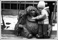
| 01/16/2005 11:25:48 AM | Friendsby rmtm333Comment: THis is a technically excellent photo. Nice DoF and tonal range. The focus is tack-sharp.
Your daughter fits nicely into the sculpture; almost as if it's putting an arm around to hug her, and there appears to be eye contact between the two.
The close crop to your daughter's head coesn't bother me, since the yarn on top of the cap keeps my eye from being pulled up and out of the image. I would like to see some creative burning on both sides where the bright snow comes into contact with the edge of the image, to help redirict the viewer's eye back into the image.
Just my opinions. |  Photographer found comment helpful. Photographer found comment helpful. |
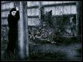
| 01/15/2005 10:40:15 AM | Not To Be So Depressive by sahkoComment: sahko
At a first , quick glance, I wasn't as impressed with this as I should have been.
You've done an excellent job with light control, DoF and compostion so the viewer's eye is directed precisely where it should be. Soft focus and darker hues prevent the attention from wandering out of the image. There's a lot of nice detail so your audience can spend time in the surroundings, but the attention always goes back to the model's face.
In fact, if I had a nit to pick, it would be the model's expression. Her body language suggests depression, but her face doen't, as much. Perhaps it just me. All the same, the image works nicely.
Kudos | | Photographer found comment helpful. |
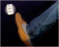
| 01/15/2005 10:30:36 AM | Kick The Habitby ace flymanComment: Nice colors and balance in the composition. The effect is a bit flawed as the foot doesn't connect, and the package only rotates, but makes no lateral movement in space. | | Photographer found comment helpful. |
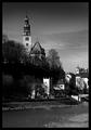
| 01/15/2005 10:26:03 AM | I resolve to travel more across Europeby jonpinkComment: jon
Very nice, indeed. In fact, my only nit is the brightest tones are in the bottom right corner of the image and they tend to draw the eye there. The specular lights on the water are nice, but I think they're in a distracting position in the composition.
If this is a crop, perhaps zooming out slightly would take those highlights, and the bright building on the right, away from the edges. If that doesn't work, then perhaps just burning in thse area.
You've a nice eye. |
| 01/15/2005 10:21:04 AM | Fire in Reykjavikby johannesComment: johannes
The biggest distraction here is the foreground. The high contrast and detail grab the viewer's eye, and there's nothing else in the image strong enough to compete with it. There's no line or shape to urge the eye from the foreground to the background.
It's basically a photo of te ground with some fireworks in the background, and I think it should be the other way around. |
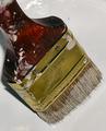
| 01/15/2005 10:17:15 AM | Home Improvementsby pahlComment: Technically, a nice photograph. Good DoF and exposure.
The composition, for me, has one major problem, The eye is automatically drawn to the pont of highest contrast; in this image, the specular lights against the dark handle at the top of the image. Attention is then drawn to the paint smudges on the handle and then out of then out of the image.
There's an opportunity to place interesting highlights in the metal part of the brush, and make it the attention grabber in the image. A second flash focussed on the metal with a stop more light, or white reflectors placed to add more light to the metal.
Eliminate any specular lights near the edges of the image. They draw attention away from the image.
Just my opinions. |
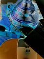
| 01/14/2005 05:31:58 PM | Online Bingesby msdoubletroubleComment: My first thought is this has been overmanipulated. My second thought is the composition is unintriguing: the near centered mouse and light base surrounded by clutter. There's no 'subject' to the image: everything competes with everything else for attention, and eventuall the eye is pulled by the mouse cord up and out of the image by the (?) which, by rights of contrast and detail, probably should be the subject, but is only partially in the image.
I apologise for having nothing to compliment, but these are just my opinions. |
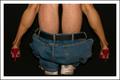
| 01/14/2005 05:25:30 PM | Start A Familyby photomayhemComment: Humorous, and the ladies legs are attractive. Somehow, the perspective seems off; I think it's because the male model kept a discreet distance from the female model. Let's not go into the other implications.
Compositionally, the pale legs of the man draw the viewers eyes up and out of the image for no successful reason. The position of the flash made the male's legs look paler, while the shoes look underexposed and the trousers dingy.
Darkening the man's legs and lightening the woman's would draw the viewer's eyes past the man and add a feeling of depth to the image.
It wouldn't hurt to saturate the red shoes, as I get the same feeling of under-exposure when I look at them.
Just my thoughts. | | Photographer found comment helpful. |
| 01/14/2005 05:17:37 PM | Eat less...by _wu_Comment: Hey _wu_
The most interesting aspect of this photo, for me, is the detailed grain in the metal of the fork. It is also the most distracting as it pulls attention away from the the 'subject': the peas. The strong lines of the fork and knife, doubled by the high contrast of these utensils agains the white plate, add to this effect of pulling the viewer out of the photo. The peas seem inconsequential when they should be the main focus.
Witout the utensils, however, the image is bland.
Just my thoughts. |
Home -
Challenges -
Community -
League -
Photos -
Cameras -
Lenses -
Learn -
Help -
Terms of Use -
Privacy -
Top ^
DPChallenge, and website content and design, Copyright © 2001-2025 Challenging Technologies, LLC.
All digital photo copyrights belong to the photographers and may not be used without permission.
Current Server Time: 08/03/2025 12:44:27 AM EDT.
|