| Image |
Comment |
| 04/20/2005 10:31:11 PM |
Descent to Arrakisby srbrubakerComment: Tough I realize its paper and your image seems to be, in techical terms, nice and well executed, it doesnt have impact and is not a very interesting one. However, you've managed to create pretty good light/shadow effects. Good luck. |
 Photographer found comment helpful. Photographer found comment helpful. |
| 04/20/2005 10:26:40 PM |
speedhands rpsby canegridereComment: I think you had a very good idea, which failed to be well executed. Your image is a bit confusing, has too much noise and brightness. Maybe decreasing brightness and contrast would help improve you photo. Good luck. |
| Photographer found comment helpful. |
| 04/20/2005 10:21:48 PM |
Cut Upby Rusty spursComment: I had a very similar idea! (which, for obvious reasons, I find to be very clever! lol)
However, your image lacks quality (was it taken in low res?), colors and, how should I put it, charm. The final result is not a very appealing one. Maybe downsizing it a bit will improve the outcome. Good luck. |
| 04/20/2005 10:15:41 PM |
Patchworkby mkirdalComment: Interesting and original set up. However, I feel you could have arranged a better composition and a better background. Its an average image, which i feel lacks impact and vibrant colors, in order to make it appealing. Good luck. |
| Photographer found comment helpful. |
| 04/20/2005 10:10:53 PM |
Rock,Paper,Scissorsby booneComment: Though you've included all three items in your shot, your composition lacks creativity and impact. The picture looks too soft and I find it to be too small, when you have the option to submit 640x640px sized pictures.
Maybe by adding contrast and sharpenning the image, it'll look better. |
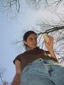
| 04/20/2005 10:06:32 PM |
Rockby theSajComment: Well, the picture has a nice sky perspective and the girl's eyes draw you to the stone. But I find the stone to be too small and her lower area too much "in the face", which is a turn off. Othewise, its an ok, average shot. Good luck. |
| Photographer found comment helpful. |
| 04/20/2005 07:50:56 PM |
The Newsby H R VerryComment: Very nice catch. Like this picture very much, but I cant help noticing the person reading the paper is out fo focus. Anyway, good composition and nice approach of the challenge. Well done. |
| Photographer found comment helpful. |
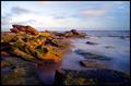
| 04/20/2005 07:44:20 PM |
Ragged by TychoComment: Amazing shot. Great quality and definition, great colors and light. The water came out very nice, so did the sky. 9 |
| Photographer found comment helpful. |
| 04/20/2005 07:41:55 PM |
Serene Rocksby alanfreedComment: I'm not sure about the composition, but the colors on the rocks and the image's definition are absolutely perfect. Great shot. |
| Photographer found comment helpful. |
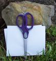
| 04/20/2005 07:39:51 PM |
Excuse us while we cut in line.....by NobodyComment: Nice title and shot. I think its is a little too bright and could use a little more contrast, perhaps. Anyway, how did you manage to display the scissors like that? did you glue them or something? lol
Good job, hope you do well on this challenge. |
| Photographer found comment helpful. |
Home -
Challenges -
Community -
League -
Photos -
Cameras -
Lenses -
Learn -
Help -
Terms of Use -
Privacy -
Top ^
DPChallenge, and website content and design, Copyright © 2001-2025 Challenging Technologies, LLC.
All digital photo copyrights belong to the photographers and may not be used without permission.
Current Server Time: 08/05/2025 09:49:13 AM EDT.