| Image |
Comment |
| 06/23/2002 11:11:00 PM |
Simply Redby BNCComment: very nice concept and very nicely done. creates a unique illusion. |
| 06/23/2002 11:15:00 PM |
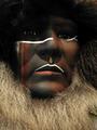
Eyesby BAMartinComment: nice composition and lighting. the shadows came across nicely in this. i'm kind of torn on the fact that this photo consists entirely of another piece of artwork, which is technically against the rules here, but the shot is nice so i'm going to grade it without taking that into consideration. |
 Photographer found comment helpful. Photographer found comment helpful. |
| 06/23/2002 11:42:00 PM |
Garden Shadowsby jimmspComment: i like the shadows here a lot. i can't really say a lot about this picture. it's well focused and composed, and it's got a pretty interesting subject. it doesn't really "pop" at me, though, which is why i can't score it really high. but it's definitely well done. |
| 06/23/2002 11:30:00 PM |
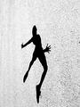
Shadow as Silhouetteby indigo997Comment: this is a good attempt. the shadow is a little too soft, i think, and the picture is very grainy. the underexposed bottom is also a little distracting. a nice pose and a good crop, though. i like the blue hues to this, but maybe a black and white version might look better. |
| Photographer found comment helpful. |
| 06/24/2002 12:08:00 AM |
|
| 06/23/2002 11:37:00 PM |
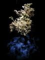
Patterns On Blueby Gene L.Comment: cool shadows. a couple of things detract from this photo, though. i think the flowers have been sharpened too much. and the dark part at the bottom is very grainy. also, there are a couple of artifacts at the top of the shot that take away from the pure black background. overall, a good concept and a decent shot. |
| 06/23/2002 11:28:00 PM |
Shadow Dancerby SonifoComment: very nice shadow, but something bothers me about this shot. i think it's the texture of the background, mostly, which kind of cuts into the shadow and makes it look too sharp. i think the out of focus left side also bothers me a bit. a different crop might be nice, too, maybe moving the figure over to the left side to get rid of that soft focus and creating more negative space. overall, though, a nice shot. |
| Photographer found comment helpful. |
| 06/23/2002 11:13:00 PM |
Rustshineby Ricky CleaveComment: i like this shot. good composition and framing. nice shadows and lighting. maybe could use some leveling to bring out the reds and oranges in the rust a little more, but overall very nice. |
| 06/24/2002 12:21:00 AM |
|
| 06/23/2002 11:33:00 PM |
|
Home -
Challenges -
Community -
League -
Photos -
Cameras -
Lenses -
Learn -
Help -
Terms of Use -
Privacy -
Top ^
DPChallenge, and website content and design, Copyright © 2001-2025 Challenging Technologies, LLC.
All digital photo copyrights belong to the photographers and may not be used without permission.
Current Server Time: 08/01/2025 04:28:58 AM EDT.


![the engineering marvels of general electric [aka where's the butter]](https://images.dpchallenge.com/images_challenge/hidden.png)