| Image |
Comment |
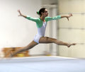
| 04/20/2006 10:08:48 AM |
The Gymnastby bobdaveantComment: This is such a beautiful shot, Bob. I like the motion very much and the green on her shirt really puts the viewer's eye right on her - I bet you're proud of her and she of you (great photographer dad and all that)! |
 Photographer found comment helpful. Photographer found comment helpful. |
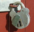
| 04/20/2006 08:07:57 AM |
OLD LOCK.by CONRADComment: I like the simple colors - this is what I would call an honest picture (I don't know why - sounds silly when I type it :-) I think the centering is a bit much, though - would love to see a bit more space on the right or left side. Very sharp in a good way! |
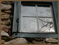
| 04/20/2006 08:06:09 AM |
Springhouse Windowby bumpusComment: Wish it didn't have the brown border. I hate it when people comment on borders because it's such a personal thing, but in this case, it does draw my eye away from the picture, so I feel it's worth mentioning. Otherwise, the concept with the window is pretty good. |
| Photographer found comment helpful. |
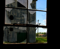
| 04/20/2006 08:04:31 AM |
Derelictby JutildaComment: Ooooh, I like this one! The broken windows and that old structure (silo?) in the background are so interesting. I also like the way you've put an uneven amount of the wall space on either side. Too bad that power line pole is in the background, though - but I guess it would've been a bit much to move for a stupid challenge, eh? :-) |
| Photographer found comment helpful. |
| 04/20/2006 08:02:07 AM |
Antique Bulb and Lampby KathycComment: Even though both objects, the background and the lamp, are attractive in their own way, there's too much distraction because both are ornate - especially the background. I think this is a beautiful lamp and would love to see it presented in a more straight way and with a plain background. |
| Photographer found comment helpful. |
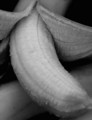
| 04/20/2006 08:00:23 AM |
Used to be freshby LilhoopComment: Still looks pretty fresh to me, especially if you give it a good crop at the bottom :-) This image doesn't hold my interest in anyway, I'm afraid to say. |
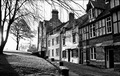
| 04/20/2006 07:59:19 AM |
Dun Cow Laneby fredandaudComment: Very nice. I bet it was a tough decision between color and b&w, because it looks like this probably is quite colorful as well. You've done a great job with the b&w, though. I like the lines leading up towards center left. |
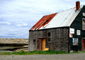
| 04/20/2006 07:56:53 AM |
Old Fish Shackby KOKOCATComment: I'd love to see this in black and white. The textures and lines are really interesting, with the wood and the stones in the background. |
| Photographer found comment helpful. |
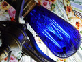
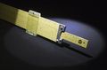
| 04/20/2006 07:55:15 AM |
The Slide Ruleby BakerBugComment: Nice with the spotlight! This looks like a stock shot - the shadow adds interest. (hey, and aren't these complementary colors, too?!) Good job. |
| Photographer found comment helpful. |
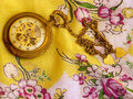
| 04/20/2006 07:51:49 AM |
Forever 7:29by dahvedComment: What a beautiful cloth this is! I think the watch definitely says "something old", but I do feel the image is too busy due to the fact that both the watch and the cloth are relatively ornate. |
| Photographer found comment helpful. |
Home -
Challenges -
Community -
League -
Photos -
Cameras -
Lenses -
Learn -
Help -
Terms of Use -
Privacy -
Top ^
DPChallenge, and website content and design, Copyright © 2001-2025 Challenging Technologies, LLC.
All digital photo copyrights belong to the photographers and may not be used without permission.
Current Server Time: 08/15/2025 07:43:50 PM EDT.