| Image |
Comment |
| 04/22/2006 03:42:36 PM |
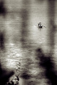
Another Storm Approachesby sir_bazzComment: Wow, wow, wow - I want to know how you processed this! I would love to be able to make a picture like this, with this light. This inspires me incredibly. |
 Photographer found comment helpful. Photographer found comment helpful. |
| 04/22/2006 03:40:02 PM |
Used to be someone's loveby timluComment: Beautiful composition. I think the light is either harsh or flat. I'm not that good with this stuff yet to be more specific, but can see that if the light were a little more dramatic or softer, this would be a winner. |
| Photographer found comment helpful. |
| 04/22/2006 03:38:08 PM |
Old Schoolby MarcelLainezComment: The blur in the lower left and the long shadow lower right are a tad distracting, but this is such a gorgeous image that the distracting things are easily forgiven :-) I really like the orientation of the image and all the negative space. |
| 04/22/2006 03:35:00 PM |
Old School Hi Matic Gby youngnovaComment: This is interesting. At first glance, I thought it looked oversaturated. Now, on closer inspection, it seems extra, but not over saturated - it's kind of cool. The folded cloth with lint (I know the lint comment is picky -sorry!) is a little distracting. Would also like to see equally sharp focus on the camera body text as on the lens text. I like the colors reflected in the lens. |
| Photographer found comment helpful. |
| 04/22/2006 09:25:39 AM |
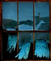
Blowing in the wind...by CEJComment: This wins the prize for world's most perfect crop! The curtains are wonderful. My eye keeps going up to the chimney reflection in the background though, darn it. The bottom half of this is a 10 for me, top half only a 5 - guess I'll split the difference and give you a 7.5 = 8 :-) |
| Photographer found comment helpful. |
| 04/22/2006 09:21:13 AM |
|
| Photographer found comment helpful. |
| 04/22/2006 09:20:12 AM |
LK_0015.jpgby eschelarComment: Thanks for sharing this series. What a camera -- and what a cool thing to have all these kids love you so much! They're really nice portraits and I'm sure they will be a great memory for you in the future. |
| Photographer found comment helpful. |
| 04/22/2006 05:03:32 AM |
Palace of Fine Artsby floydroweComment: For me, this would be better in regular black & white rather than the pinkish-red. Would love to see a bit darker midtones or increased contrast, too. Looks like a really interesting place! |
| Photographer found comment helpful. |
| 04/22/2006 05:00:44 AM |
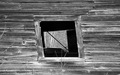
Old Windowsby shanelighterComment: I think the character of this image could be improved if the window weren't so dead-center. Also, with a lift in contrast, I think this could be quite nice. |
| Photographer found comment helpful. |
| 04/22/2006 04:58:38 AM |
|
| Photographer found comment helpful. |
Home -
Challenges -
Community -
League -
Photos -
Cameras -
Lenses -
Learn -
Help -
Terms of Use -
Privacy -
Top ^
DPChallenge, and website content and design, Copyright © 2001-2025 Challenging Technologies, LLC.
All digital photo copyrights belong to the photographers and may not be used without permission.
Current Server Time: 08/15/2025 09:03:32 AM EDT.