| Image |
Comment |
| 05/09/2005 03:45:55 PM |
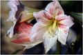
Face to Face amid inward splendorby SDWComment: This is so sharp that it's almost three-dimensional. Not sure how I feel about the image itself, but the colors and the "pop" are really incredible. |
 Photographer found comment helpful. Photographer found comment helpful. |
| 05/09/2005 03:43:21 PM |
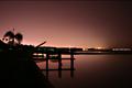
Ringside Seatby aerogurlComment: I really like the black and white treatment and the simple composition. It's very effective and nicely un-cluttered. For my taste, a black or gray frame might have been nice. This is my favorite entry so far. |
| Photographer found comment helpful. |
| 05/04/2005 07:08:55 PM |
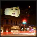
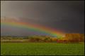
As Time Goes Byby instepsComment: This is a picture with a whole story! There's so much going on here and you've still managed to keep it from looking over-cluttered. Nice work. The only thing that might make it better (for my taste only) is if the bright white light at the bottom, with its long streak, wasn't quite so bright. |
| Photographer found comment helpful. |
| 05/04/2005 07:03:56 PM |
|
| Photographer found comment helpful. |
| 05/04/2005 05:15:55 PM |
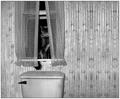
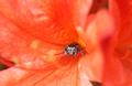
I'm watching you!by BeetleComment: I missed this one in the voting, but would've given it a high score. It's really nice colors and the cutest damn spider ever! |
| Photographer found comment helpful. |
| 05/04/2005 05:13:33 PM |
Johnny Guitarby pawdrixComment: I was one of the two who gave this a ten. I didn't realize until now that I read the comments that maybe it wasn't exactly a "minimal" study, but I was (and still am) so taken by the beauty of this shot that I suppose I forgot to think of this challenge's theme. All the same, I would give it the same vote again. The colors, composition, and the idea that in some people's minds, this cool guy might be considered "minimal" <-- but I hope not. Glad you entered this and I wish it had scored higher. |
| Photographer found comment helpful. |
| 05/04/2005 05:06:38 PM |
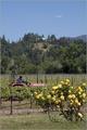
Cultivator revisited.by whagerbaumerComment: This looks really good - what an improvement over the other in colors. I thought the width was nice in the original version, though - maybe you could also try cropping in from the bottom instead of such a sharp crop on the sides (but I like this crop, too - it's just an idea). |
| Photographer found comment helpful. |
| 05/04/2005 04:32:41 PM |
|
| Photographer found comment helpful. |
| 05/02/2005 04:41:22 PM |
|
| 05/02/2005 04:17:05 PM |
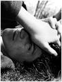
Meloncholyby TranquilComment: I like this shot - it's too bad you didn't enter it in Moods. The hand has some hot spots that distract from the face, which is very expressive. Nice and clear image. |
| Photographer found comment helpful. |
Home -
Challenges -
Community -
League -
Photos -
Cameras -
Lenses -
Learn -
Help -
Terms of Use -
Privacy -
Top ^
DPChallenge, and website content and design, Copyright © 2001-2025 Challenging Technologies, LLC.
All digital photo copyrights belong to the photographers and may not be used without permission.
Current Server Time: 08/12/2025 06:06:18 AM EDT.