| Image |
Comment |
| 11/19/2005 02:31:26 PM |
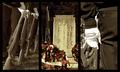
Once Upon A Birdby YoungerComment: This is one of the few thick, "fancy" frames that I really, really think adds to the whole composition. It doesn't hurt that your subjects are beautiful, though. The feather to the right is definitely the strongest, in my opinion. I was about to suggest that it might be nice with the center feather more centered. But on closer look, I see that its shadow contributes nicely. |
 Photographer found comment helpful. Photographer found comment helpful. |
| 11/19/2005 02:24:51 PM |
Cornersby myceliumComment: Beautiful! It might be nice with the plaster "dents" cloned out on one of the end shots, so it doesn't look like the exact same image. I love the smooth lines and light here, with good, strong color. |
| Photographer found comment helpful. |
| 11/19/2005 02:20:56 PM |
Osprey On The Huntby NobodyComment: The lighter shade of blue in the middle makes for a nice compostion. I think I see some post-processing (sharpening) artifacts on the left that are a bit (quite minor) distracting. Amazing detail you've captured! |
| Photographer found comment helpful. |
| 11/19/2005 06:51:31 AM |
Courage, Honor, Integrityby dahkotaComment: This is a moving entry (and I'm not the most patriotic person in the universe, that's for sure). It's emotional. Your color choices have really contributed to that. I like the crops you've chosen, too. Nice job. |
| Photographer found comment helpful. |
| 11/19/2005 06:49:31 AM |
Errant Headstocksby NordlysComment: Awesome! This is a creative take on the framing, that's for sure. The first two could stand to be as sharp as the last, but this is really great! |
| Photographer found comment helpful. |
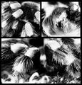
| 11/19/2005 06:48:00 AM |
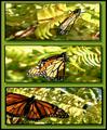
Monarch Menagerieby espy2Comment: It looks like you were going with a 3-D effect on the frame. There's a great 3-ness in the composition, going from big, lower-left placement, center, and finaly, folded wings with a right subject placement. The frame doesn't work well for me online at all, although I can see that it might be nice in a bigger version and on a wall. I think it is the brightness of the green against the gray of the voting background that bothers me. The light, colors, and composition of the actual images, though, get high ratings from me. |
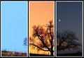
| 11/19/2005 06:42:59 AM |
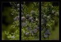
Window to Blueby SandyPComment: I think this is one very, very beautiful image. It's so nice that I think triptych doesn't do it justice. In my opinion, it would be much nicer as a standalone image - but keep the wonderful outer frame! The subtle violets with the green are clear and perfect. |
| Photographer found comment helpful. |
| 11/19/2005 06:40:19 AM |
In dark cornersby funnylooksComment: ewww, this is scary, but nicely done. Upper left image is best in my opinion, while upper right is a little hard for me to figure out. |
| Photographer found comment helpful. |
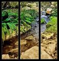
| 11/19/2005 06:38:39 AM |
Transitionby elsapoComment: Very pretty colors. The upper right and the green in the center grass might be a little over sharpened. I'm also not sure how I feel about this with the heavy frame. Looks like a beautiful place. I especially like the browns - both on the rocks (and decaying leaves) to the right and in the water. |
| Photographer found comment helpful. |
| 11/17/2005 01:44:40 AM |
|
| Photographer found comment helpful. |
Home -
Challenges -
Community -
League -
Photos -
Cameras -
Lenses -
Learn -
Help -
Terms of Use -
Privacy -
Top ^
DPChallenge, and website content and design, Copyright © 2001-2025 Challenging Technologies, LLC.
All digital photo copyrights belong to the photographers and may not be used without permission.
Current Server Time: 08/15/2025 05:26:36 AM EDT.