| Image |
Comment |
| 01/24/2003 10:08:54 AM |
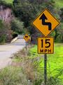
At the Corner of Charles and Mapleby karmatComment: Way to get aggressive with the viewpoint! This would have been a good time for fill-flash. The one stripe across Charles is OK, but the total shadow on Maple is tough to overcome. |
 Photographer found comment helpful. Photographer found comment helpful. |
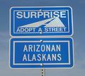
| 01/24/2003 10:07:19 AM |
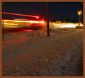
Stop!by JackoComment: Nifty colorshift. Lack of positive color rendition makes it difficult to rate the photo technically. Creative. |
| Photographer found comment helpful. |
| 01/24/2003 10:06:31 AM |
Show Me A Signby bobgaitherComment: Excellent stopped-down lenswork. Good saturation and sharpness. slightly light for my *taste*, but a good photograph nevertheless. |
| Photographer found comment helpful. |
| 01/24/2003 10:05:34 AM |
Head Gamesby jitamsComment: Unfortunately, overexposed on the sign itself. Otherwise a reasonably interesting shot, and humourous. |
| Photographer found comment helpful. |
| 01/24/2003 10:03:53 AM |
International Roadsignby David EyComment: I'm sure you get lots of comments that "this is not a roadsign." I disagree. This may be THE most important roadsign. Good exposure and sharpness. Would have skewed a little to the left, if it were possible. Possibly, I would have used heavy zoom and a wide-open lens to make the cross very sharp, and the environment less sharp. |
| Photographer found comment helpful. |
| 01/21/2003 12:00:56 PM |
|
| 01/21/2003 11:59:58 AM |
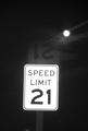
Broken Lawsby DJLubaComment: Oddly, this is overexposed a bit, causing the sign to look out of focus. I am looking for a cohesive theme, but am coming up short. |
| Photographer found comment helpful. |
| 01/21/2003 11:58:40 AM |
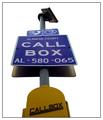
Freeway Call Boxby TarbiniComment: Something misses here for me, which is frustrating, because it has most of the elements of a good photograph, to me. Maybe it's the letdown of the yellow on the callbox itself. I'll update if I can think of it. 6 |
| Photographer found comment helpful. |
| 01/21/2003 11:55:56 AM |
signs of sea dogsby andresComment: Great title. Flash with slow sync to make the sign stand out. Sign dropping into the field of the inlet is unfortunate. 6 |
| Photographer found comment helpful. |
| 01/21/2003 11:54:28 AM |
Oxymoronby briphotoComment: Now that's funny. Slightly overexposed, but could be fixed with levels. |
| Photographer found comment helpful. |
Home -
Challenges -
Community -
League -
Photos -
Cameras -
Lenses -
Learn -
Help -
Terms of Use -
Privacy -
Top ^
DPChallenge, and website content and design, Copyright © 2001-2025 Challenging Technologies, LLC.
All digital photo copyrights belong to the photographers and may not be used without permission.
Current Server Time: 08/22/2025 07:35:12 PM EDT.