| Image |
Comment |
| 05/01/2003 12:23:53 PM |
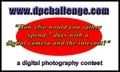
www.dpchallenge.comby CreativeFlyPhotoComment: Nice choice of words but font treatment doesn't appeal. Not sure what that red oval is doing there? Would prefer to see a logo or something relevant.
Not a winner for me, sorry!
Kind Regards
4, Kavey |
 Photographer found comment helpful. Photographer found comment helpful. |
| 05/01/2003 12:22:07 PM |
Stickerby lumbardhComment: Nice text treatment. Overall composition and choice of images don't work for me.
Sorry!
Kind Regards
4, Kavey |
| Photographer found comment helpful. |
| 05/01/2003 12:21:17 PM |
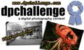
Photo Stickerby jimsappComment: Nice photo but it\'s choice baffles me - other than that it\'s a nice pic it doesn\'t convey digital photography or contest to me.
Not keen on bevelled and gradiated treatment of text/ logo.
Not a winner for me, sorry!
Kind Regards
4, Kavey |
| 05/01/2003 12:21:05 PM |
DPC: Universally The Best.by BigSmilesComment: Interesting idea, though a little too United Colours of Benetton/ world peace and harmony for me - not that I've anything against either!
Not a winner for me, sorry!
Kind Regards
4, Kavey |
| 05/01/2003 12:18:31 PM |
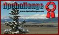
DPChallenge Colorby OneSweetSinComment: Nice idea in principle.
But the use of the negative silhouette speaks more of film photography than digital.
Also not at all keen on the gradiated background, perhaps because I think the colour clash so much with the colours of the photos themselves.
5, Kavey |
| 05/01/2003 12:17:22 PM |
|
| Photographer found comment helpful. |
| 05/01/2003 12:16:02 PM |
|
| Photographer found comment helpful. |
| 05/01/2003 12:15:14 PM |
Stick oneby pikytoComment: Nice that it's simple and the colours are attractive.
6, Kavey |
| 05/01/2003 12:14:12 PM |
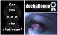
Can you see the challenge? by TarbiniComment: Nice treatment of image.
Not keen on overall composition - the divisions just don't seem to be the right size to balance each other - especially when two are black and one so light.
The website name is hard to read.
Not keen on faded logo beneath left panel or the blurred "see" text.
Best imrovement to me would be to completely lose the left panel - I like the resulting square sticker rather a lot.
5, Kavey |
| 05/01/2003 12:12:10 PM |
Stickerby cathysappComment: Border too heavy - makes it look more amateurish. Not keen on gradiated bevelled font or logo but like repition of logo.
5, Kavey |
Home -
Challenges -
Community -
League -
Photos -
Cameras -
Lenses -
Learn -
Help -
Terms of Use -
Privacy -
Top ^
DPChallenge, and website content and design, Copyright © 2001-2025 Challenging Technologies, LLC.
All digital photo copyrights belong to the photographers and may not be used without permission.
Current Server Time: 08/25/2025 04:07:55 AM EDT.