| Author | Thread |
Comments Made During the Challenge  |
|
|
05/07/2003 04:48:33 PM |
|
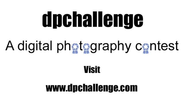
not very eye catching- nice thought, though |
|
|
|
05/05/2003 04:38:36 PM |
|
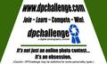
The lettering and the actually words fit well just wish you had a photo or some kind of a background instead of just being black and white with nothing more than the blue ribbons |
|
 Photographer found comment helpful. Photographer found comment helpful. |
|
|
05/05/2003 12:14:31 PM |
|
I wish the top line included a .com |
|
| Photographer found comment helpful. |
|
|
05/01/2003 08:54:34 PM |
It's a tie between you and another one for winner. I like the sheer simplicity of it,
very eye catching, and readable. I give it a 10 Simplicity always is the best way to go. |
|
| Photographer found comment helpful. |
|
|
05/01/2003 12:16:02 PM |
Nice and simple. Clever incorporation of logos.
6, Kavey
|
|
| Photographer found comment helpful. |
|
|
05/01/2003 11:34:37 AM |
|
There can be only one blue ribbon. |
|
Home -
Challenges -
Community -
League -
Photos -
Cameras -
Lenses -
Learn -
Help -
Terms of Use -
Privacy -
Top ^
DPChallenge, and website content and design, Copyright © 2001-2026 Challenging Technologies, LLC.
All digital photo copyrights belong to the photographers and may not be used without permission.
Current Server Time: 06/29/2026 12:06:11 PM EDT.