| Image |
Comment |
| 05/12/2003 05:14:12 PM |
Bad Ass Glassby scab-labComment: This is a lovely image - I love the juxtaposition (oh my god, hark at me, I'm using the word "juxtaposition" with a straight face) of the glass, water and ice with the bowl/ vase behind.
I like the curves against the straight edges of the ice cubes - the curves behind really are spectacular - especially in the gradiation of colour.
I'm not really into blue as a colour but this is a wonderful image.
9, Kavey |
 Photographer found comment helpful. Photographer found comment helpful. |
| 05/12/2003 05:07:46 PM |
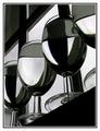
Black and Whiteby JeanComment: I really like the abstract nature of this - it's like those drawings where a kid draws lots of curvy lines across a page and colours in random segments. Except the composition here certainly doesn't appear random. I like the dark diagonal framing areas to top left and bottom right. The curves within the glass and the different liquids are great against the straight edges of the window frames. The unusual viewpoint is also appealing.
In my top 5.
9, Kavey |
| Photographer found comment helpful. |
| 05/12/2003 05:05:28 PM |
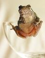
Sticky Fingersby connieComment: Wonderful picture and in my top 5 this challenge.
I'd like to see a little more light on the frog eye that's in shadow and, conversely, a little less light on the lower areas of the glass - it fades a little too much into the background (for my preferences).
I think the frog feet suckers (or whatever they are called) on the inside of the glass really show the smoothness of the glass off very well.
9, Kavey |
| 05/12/2003 05:03:44 PM |
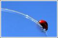
Round and Round by JackoComment: This is one of my favourites in this challenge - understated in terms of the glass itself and yet, at the same time, all about the glass!!! I really really like the composition - the curve and bug are positioned just perfectly within the frame. Great clean blue sky. Nice DOF on the edges of the glass.
Been looking at this a lot and was wavering between a 9 and a 10.
I can't think of anything I'd change and I'd buy this as a postcard so it has to be a 10 really doesn't it?
Kavey |
| Photographer found comment helpful. |
| 05/12/2003 05:01:37 PM |
Nitricby dadas115Comment: Wonderful colours! The quality of light, both on the object and on the background, is wonderful - on the background it gives the effect of a painting, on the object it really brings out the character of the glass. Love the green within the inner tube. Composition also works well for me. Top right corner a little too dark in my opinion.
9, Kavey |
| Photographer found comment helpful. |
| 05/12/2003 04:59:01 PM |
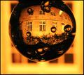
Solar Nocturnalby kiwinessComment: My absolute favourite in this challenge - beautiful quality of light, wonderful contrast, excellent DOF and a truly fascinating image.
10, Kavey |
| Photographer found comment helpful. |
| 05/10/2003 08:31:21 AM |
April Showers bring May Flowersby YomiComment: This image looks awfully familiar...
I like the image and I like the composition with the dark circle positioned as it is.
Overall image very grainy. |
| Photographer found comment helpful. |
| 05/09/2003 05:26:59 PM |
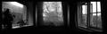
Dreams of a Bay Windowby mbardeenComment: Critique Club
Initial thoughts
As per my comment below, what I like about this image is the the atmosphere - sad and full of longing. It makes me think of a sad somebody sitting inside a room in the dark looking out of each of these windows.
Composition/ Content
I think the reason for this feeling is the solid black of the interiors that works well for me as well as the simplicity of what’s outside – no spectacular vistas – just every day suburbia.
For this reason I think the gradiated lines separating the three windows look out of place. So I’d prefer this with only a solid black space between each window – it would look almost like a supernatural bay window.
I’d like to see more space above and a little more space below each window– to me the top and bottom of the windows seems to be missing.
Fits The Challenge
I think it does though the image is perhaps more of an emotional communication than a representation of a storyline, to me.
My Opinion On The Photo
Like it!
|
| Photographer found comment helpful. |
| 05/07/2003 03:43:03 PM |
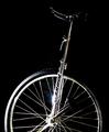
Balanceby ClubJuggleComment: Kavey Critique
Initial thoughts
Nice subtle image – great study of an interesting bit of equipment.
Composition/ Content
I really like that the wheel is cropped – it makes it more abstract than a picture of a whole unicycle might be.
I also like the angle of the sticky-uppy rod, though I think a slightly greater angle, putting the seat further into a corner, would be better still.
My only criticism of the contents lies in the way the seat fades into the background. I think I’d like a little more lighting on it to bring it out more.
I like the flare from the light but not necessarily it’s position in the frame – I’d be interested to see other shots that have that flare in slightly different positions.
Background
Rich black is good, though I am not sure that I like the way that some of the tyre and the seat fade into it. Without seeing the same shot on a different background, I have to admit that I am not sure!
Fits The Challenge
Yes, and is a little unusual too.
My Opinion On The Photo
I like the low key choice and the abstract nature but the composition doesn’t quite click for me.
|
| Photographer found comment helpful. |
| 05/07/2003 04:48:03 AM |
|
| Photographer found comment helpful. |
Home -
Challenges -
Community -
League -
Photos -
Cameras -
Lenses -
Learn -
Help -
Terms of Use -
Privacy -
Top ^
DPChallenge, and website content and design, Copyright © 2001-2025 Challenging Technologies, LLC.
All digital photo copyrights belong to the photographers and may not be used without permission.
Current Server Time: 08/25/2025 11:21:11 AM EDT.