| Image |
Comment |
| 08/14/2004 12:51:41 PM |
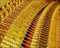
Inside the Pianoby MarjoComment: Lovely idea and lots of wonderful fiddly things to look at. Beautiful curves and lovely colours. Image seems quite noisy and, for me, that grainy effect doesn't enhance this subject. |
 Photographer found comment helpful. Photographer found comment helpful. |
| 08/14/2004 12:47:12 PM |
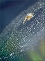
Spiderby vasilkovayaComment: What an interesting idea and beautifully done. I hate spiders (with a real phobic passion) and yet I'm so fascinated by the tilted composition, the limited focus on just one segment of the web and the colours. I think it would be even stronger were the spider in focus too though only if this could be achieved without bringing too much else into focus. Very original! |
| Photographer found comment helpful. |
| 08/14/2004 12:45:23 PM |
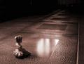
Sittingby LuxvichComment: I like the way the light illuminates only a small area and we're left wondering how large the space is and what else is in it. The little doll adds a surreal touch as does the rosey toning. |
| Photographer found comment helpful. |
| 08/14/2004 12:42:58 PM |
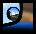
Down The Roadby pearcerComment: The thick black borders of the mirrors combine with your border to create an illusion of a stained glass window. The blurred colours in the main section add to that feel. The exposure of the segment in the smaller round mirror are a little dark and unfortunately not hugely interesting in terms of content. That said I think this is a really creative idea and you deserve kudos for the unique perspective. |
| Photographer found comment helpful. |
| 08/14/2004 12:40:00 PM |
Sea mist descendingby bpickardComment: Lovely effect created by sea mist and nicely framed by foliage. The lines of the path and lamp posts are pleasing but would be more so if you rotated the image before cropping to restore the posts to a true vertical. |
| Photographer found comment helpful. |
| 08/12/2004 04:17:35 PM |
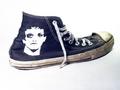
One Favorite Sneakerby melismaticaComment: An everyday object but not presented in a particularly original, creative or visually appealing way. Lighting seems a touch blown out and composition feels routine and static. Doesn't have the creativity and impact of many of your other images. |
| Photographer found comment helpful. |
| 08/12/2004 04:12:52 PM |
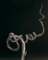
A Natural Twistby melismaticaComment: Oooh now this is just beautiful! Textures are lovely and the composition is just wonderful! I think my preference would be for a slightly sharper image, mainly on the frontal area of the twig, but retaining the beautiful shallow DOF you have used to throw the spiral tip out of focus. This really is very appealing. |
| Photographer found comment helpful. |
| 08/12/2004 04:07:59 PM |
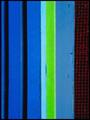
Stripesby melismaticaComment: I like many aspects of this image.
I really like the way that the lime green stripe and the red mesh with black background make the blue stripes pop out more. I also like the composition - the choice of how close to get to the subject in order to position the green stripe and red mesh just so in the image; taking up just that amount of space out of the overall blue.
My main dislike is lack of detail in the texture. The soft focus was probably deliberate but doesn't work for me. I'm finding myself straining to see texture that isn't there and that's making my viewing experience slightly frustrated.
Overall my feelings about this image are much more positive than negative. |
| Photographer found comment helpful. |
| 08/12/2004 02:04:48 PM |
Pants 01by MousieComment: I gave this a 6 as I like the unusual viewpoint and the strang perspective that makes the feet look so small and the rest of the person look so big. But it doesn't appeal hugely. Light is a bit strange centred on the floor between the feet. A touch more light higher up might bring out details of texture of the jeans? Message edited by author 2004-08-17 07:14:20. |
| 08/12/2004 02:03:11 PM |
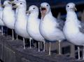
Which one is named "Laurie?"by photomComment: I gave this image a vote of 5 because although we have lots of feet they didn't seem to stand out to me within the image much. Also because the image is quite dark and the focus isn't wonderful and the cropping doesn't do anything for me - one bird has lost his head. I do like the expression on the second (and most focused) bird. |
| Photographer found comment helpful. |
Home -
Challenges -
Community -
League -
Photos -
Cameras -
Lenses -
Learn -
Help -
Terms of Use -
Privacy -
Top ^
DPChallenge, and website content and design, Copyright © 2001-2025 Challenging Technologies, LLC.
All digital photo copyrights belong to the photographers and may not be used without permission.
Current Server Time: 09/01/2025 06:05:13 PM EDT.