It was your private message to me defending your advertsiment entry against a comment I made which began the conversation about perspective. Do you not see the irony here? My comment on your entry was not an invitation for you to send me a private critique of my work and a lesson on barrell distortion. Since you did so, I replied in a very reasonable manner. My recollection of the message was that you suggested a vertical format instead of a horizontal one. Perhaps in my haste to get through the message I misread parallel as horizontal and thus the confusion. I don't know since I no longer have the message.
Your whole attitude toward me from the start has been one of condescension. Notice that I have not suggested you don't know what you are doing yet you continue to disparage my skills and experience because I disagreed with you regarding some comments you made. I was simply responding in the manner in which you have chosen to respond to my comments in the past.
You are giving me all lot of grief for very little. Can you not accept that I don't care for your method and move on? I'm not suggesting you don't have anything to offer someone who enjoys your style of commenting but it is an approach that doesn't work for me. You come off rather like a spirtual adviser. As if you have already experienced it all and are now imparting some of that wisdom to the rest of us ignoramuses.
Your comments suggest I don't put much planning or care into my composition. Your comments on this image suggested a studio approach when it seems quite clear to me that this isn't that type of shot. I was making it clear that I took the picture outside that kind of environment and further explained that the creative intent behind the image suggested something other than the studio approach. I felt that your critique ignored this type of approach and vision altogether. It is clear to anyone viewing your portfolio on this site and your personal web site that you are most comfortable in a studio environment. That is your style but you shouldn't ignore other methods out of turn when you are offering critiques to a varied population of artists. It is this type of narrow-mindedness that makes me reject your teaching. I certainly don't reject all teaching.
**********************************************************************
Again you misunderstand the simplest concepts of a camera. It does not matter how you frame an image. My reference is to holding the back of the camera parallel to the image. In other words, picture an imaginary line rising from the ground which is parallel to the lines of the buildings. If you do not line up the plane of the sensor along this imaginary ...the lines of the building begin to converge, This is very rudimentary, and here was your reply: "I held my camera vertically for the shot you mentioned but I was fairly close to some rather tall buildings and the Nikon Coolpix 700 has a fairly wide angle lens so I always get a bit of distortion." You did not understand that my comment had nothing to do with how you framed the picture, but more with the position of the sensor. Some photographers employ a level. The convergence in your image has nothing to do with how you frame the picture.
But listen, you are so right. You always are and there is no point replying to you again. say what you will, I will not respond. Let others judge your genius. You are just too overwhelming and you tower us all. I speak like I have because your entire photographic knowledge is in your pictures. An experience photographer knows the level of knowledge by seeing a handful of prints from any photographer. A portfolio is an open book.
Yesterday, I was editing some photos and decided to edit this one using the many suggestions that it was a bit soft focus and dark. I used the median filter on the original to soften some of the noise which was the result of a fairly high ISO rating due to late afternoon light and shade from the house. I figured the blur wasn't so important in an abstract and weighed that against the possible comments of 'too noisy' I anticipated receiving. ;-D
Anyway, here is the edited version and I think it is a bit better. It is still kind of dark but I couldn't seem to adjust that without losing some of the vibrancy in the colors.
You suffer from a simple problem: you do not know how to take criticism. When I first commented on your cathedral image I said you needed to hold the camera perpendicular to the ground, or keeping the film or sensor parallel to the building. Your reply was, "I held the camera parallel, it is the fault of the lens." If you study the lens subject you will find that two of their faults are pin-cushioned and barrel distortion. The cheapest lens will not converge the lines in an image.
Let me refresh your memory a bit. When you commented on the photo you are referring to it was in a private message defending your entry after a comment I made during the voting. My comment on your entry for the Advertisement challenge, was to the effect that the frame was a bit tilted. You defended your entry and went on to explain how I could make a past entry better. My photo in question had a problem with converging lines at the top of two buildings. You suggested it was because I framed the image horizontally and went on to suggest that I should have framed it vertically. My response to this suggestion was that I didn't, in fact, frame the subject horizontally, rather I had framed it vertically. In short, you were telling me I should have done something I had actually done.
The comment you have quoted me with is bogus. It isn't even in my style of speaking or writing. What I actually said, in paraphrase, was that my camera (a Nikon at the time) had a fairly wide angle lens which creates a certain amount of distortion, including the convergence that was evident in my photo. I also commented that I was interested in the software LensDoctor which is used post-processing to fix that type of convergence, since I can't afford a perspective lens and my camera isn't one with interchangeable lenses even if I could. At any rate, my comment on your picture wasn't even about barrel distortion it was simply that the frame was a bit tilted. It certainly didn't merit a defensive private message from you.
The incident in question is only one of the times you have sent me a private message defending your entry to me. They have frequently been condescending in nature. Why is it acceptable for you to defend your work in private messages to me (not to mention by criticising my portfolio) but when I defend my choices on my own image I am
failing to 'take criticism with grace'. No, I simply can no longer graciously accept criticism from you who has time after time done me the same discourtesy in private messages. Worse, you've defended your work by dispariging mine. The only difference is, I responded more openly.
In closing, my problem is not with criticism, it is with criticism which is offered without taking into consideration the circumstances in which the photo was made and from the point of view that very little thought went into the process.
Originally posted by graphicfunk:
you need only expend the extra time to make it a unique image, not one that the next photographer can come by and easily duplicate.
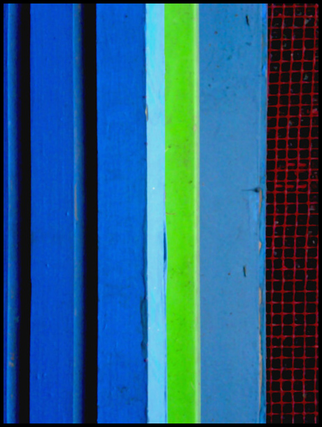
Explain to me, please, just how any photographer might happen to see this window box in my home, see its potential for an abstract image, shoot it from a very specific angle, thereby reducing a familiar object to pure line and color, and finally rotating the image 90 degrees because they felt the vertical lines made a stronger statement than horizontal lines would have?
Can you not see how my irritation is not that you dared to criticise my photo but that you did so in such a condescending and dismissive manner---even to go so far as to explain to me that my image 'falls into the abstract realm', as if I needed to be informed. BTW, I disagree that abstract images are primarily about color. Have you never seen a black and white abstract?
As for handling criticism graciously, I have since edited the original version to make a sharper, brighter image in response to some of the other comments I received.
You suffer from a simple problem: you do not know how to take criticism. When I first commented on your cathedral image I said you needed to hold the camera perpendicular to the ground, or keeping the film or sensor parallel to the building. Your reply was, "I held the camera parallel, it is the fault of the lens." If you study the lens subject you will find that two of their faults are pin-cushioned and barrel distortion. The cheapest lens will not converge the lines in an image.
From what you write below it is apparent to all that you show a disdain for the prerequisite and basic photography techniques. It is like you want to play the violin without doing scales. The basic technique is table top or studio or set up as you call it. What the basic teaches is the qualities of light and shadow and the zone system. It teaches the inverse square law of light. These simple lessons prepares the photographer to look at any image with an eye to accept or correct any existing light. To find or help make the ideal model by selecting the right time of day, if natural light and employing light deflectors.
You ask for a critique and it is also apparent to all that you have thought out the details of your image down to the last detail. A person this thorough, does not really need an opinion outside of, "Wow, another masterpiece."
You have a reply to every detail. The member from the critique club and the final vote on your image is wrong. They misunderstood you and failed to see the gem you have produced.
But then, who am I to talk. My work is inferior to yours because you say so, so there is nothing I can help you with. I am even tempted to say why you did not include the entire toe shoe and fixed the wrinkle on the sheet on your ballet shoe image, but, I know, I am too narrow minded to appreciate tight cropping and the crease, well you studied it carefully and shaped it to have a diagonal line tie the two images.
There is maybe one thing I can say with complete authority: You do not take criticism with grace. To accept criticism does not mean that you are guilty of what is proposed. If it should affect your emotions so deeply that you feel the need to lash back with a defense then the problem is in your personalty. Such an attitude will only serve as a catharsis for your feelings, but it will do little to advance your photography. But then, you have let us all know that that department of photography needs no advance because you are there and all you do is tease others by asking for advise so that you can then crush them and tell them how stupid they are. Yes, on second thought, I do look at your images and I was so blind to see that you are familiar with the inverse square law of light, that you faithfully adjust your white light with a test shot and that you are aware of all the finer nuances of the art.
I really like the way that the lime green stripe and the red mesh with black background make the blue stripes pop out more. I also like the composition - the choice of how close to get to the subject in order to position the green stripe and red mesh just so in the image; taking up just that amount of space out of the overall blue.
My main dislike is lack of detail in the texture. The soft focus was probably deliberate but doesn't work for me. I'm finding myself straining to see texture that isn't there and that's making my viewing experience slightly frustrated.
Overall my feelings about this image are much more positive than negative.
Melissa, I like this subject and I'm sorry to see it down here on page 27. I can't help but think had it been sharper it would have done a little better.
Most important with these images are the colors. The form or lines add interest. personally, I would have repainted the green because it attracts so much attention on account of its almost chartruse quality.
Another way of putting it is the small amount of green adds an interesting area of contrast--the very thing that caught my eye about the subject in the first place.
Originally posted by graphicfunk:
Of course, replace it with what. Well, I would consider a subdued red to match the mesh or a dark blue.
Of course, since this is a picture taken outside my apartment building of a window box that does not belong to me, a happy discovery of pattern and color rather than a contrived studio set-up, that would be besides the point.
Originally posted by graphicfunk:
The next step is to cash in your artistic eye by replicating the concept to move the viewer.
That would be a set-up--something I was not interested in doing. Also, which viewer am I supposed to be concerned with moving? Inevitably, I'm taking pictures that I want to see.
Originally posted by graphicfunk:
There are several ways to do this. For example: you do another take after sponging with water every other stripe or hosing the area with water. Most important is the play with light, straight light, reflected etc. In other words the pattern is your base, what can you possibly add to this image to make it stand out. Being a "blue challenge" I would have also considered a black light.
The light was existing daylight. What I played with was the point of view. I took many shots of this window box until I happened upon an angle which eliminated the soil in the green plastic insert and reduced the window box to the colored stripes and red mesh. In processing, I rotated the image because I thought the vertical lines were more interesting then the 'natural' horizontal lines of the window box. All of this was very carefully thought out by me to achieve what I desired to see. Which should answer your last presumption. Sorry to sound ungrateful but you have approached your critiques of both my photos with the assumption that I did not have a set intention in mind when I made the pictures. I've been taking pictures for a lot of years and have a very definite idea of what I want to achieve. I don't mind if someone doesn't agree with my vision but I do mind when they presume that I don't posess vision. It may not harmonize with yours. Frankly, I don't care for your photos at all but I respect that you have a personal vision and when you make a picture you knew what you were making.
Originally posted by graphicfunk:
To conlude, you have a very good knack for finding unusual patterns and you need only expend the extra time to make it a unique image, not one that the next photographer can come by and easily duplicate. dan
These compositions fall inro the abstract realm. Most important with these images are the colors. The form or lines add interest. personally, I would have repainted the green because it attracts so much attention on account of its almost chartruse quality. Of course, replace it with what. Well, I would consider a subdued red to match the mesh or a dark blue.
The composition is very nice with the vertical lines running up and down and it is obvious that you have a sharp eye to find these interesting patterns. The next step is to cash in your artistic eye by replicating the concept to move the viewer. There are several ways to do this. For example: you do another take after sponging with water every other stripe or hosing the area with water. Most important is the play with light, straight light, reflected etc. In other words the pattern is your base, what can you possibly add to this image to make it stand out. Being a "blue challenge" I would have also considered a black light.
To conlude, you have a very good knack for finding unusual patterns and you need only expend the extra time to make it a unique image, not one that the next photographer can come by and easily duplicate. dan