| Image |
Comment |
| 12/29/2004 02:15:10 PM |
|
 Photographer found comment helpful. Photographer found comment helpful. |
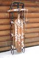
| 12/29/2004 02:14:37 PM |
Happy 2005! Peace, Love, Health and Ribbon! by LuxvichComment: This is techincally well-done, but I'm not sure how the stopped motion helps the mechanical theme, besides, we don't use corkscrews on champagne... For these reasons, I rank it somewhat lower than I'd otherwise do. |
| Photographer found comment helpful. |
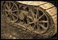
| 12/29/2004 02:12:56 PM |
Cat Traxby bryanbrazilComment: Lovely, massive feel to this, marred by an awkward framing of the key element. we need to see, at least, all of the rear rotor, and arguable some of the track above it. |
| Photographer found comment helpful. |
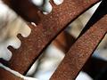
| 12/29/2004 02:11:27 PM |
Simple Machinesby troyloxComment: Conceptually pleasing. It would rank higher if it had the critical sharpness it's just begging for, and if the lighting were a little softer. I'd also question the very warm chromatics here. I wonder how it would work if the drivers were cool-ble-steel looking and the rest a more desaturated sepiaesque tone? |
| Photographer found comment helpful. |
| 12/29/2004 02:09:36 PM |
Retiredby scrum8Comment: extraordinary positive/negative dialogue; first the BG is UP, then the BG is DOWN, it cycles visually. I wish there were better separation between the teeth and the drak BG stripe. A real sleeper of an image. |
| Photographer found comment helpful. |
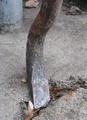
| 12/29/2004 02:07:30 PM |
Prybarby GeneralEComment: I admire this for the very fundamental take on what it means to be mechanical; a prybar is the original machine, aka "lever". The foreground leaf reall distracts, and I wish the image were more dynamic. |
| Photographer found comment helpful. |
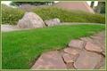
| 12/29/2004 01:59:37 PM |
"Hidden Face"by tfarrell23Comment: I really don't see a face here, except maybe a squinting one on the big rock, not really "trhere" for me... |
| Photographer found comment helpful. |
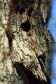
| 12/29/2004 01:58:10 PM |
Ent of Fangornby scrum8Comment: It's a nice face, but the background is way too confusing and cluttered to show the face to best advanhtage. |
| Photographer found comment helpful. |
| 12/29/2004 12:55:34 PM |
Lighting The Wayby atsxusComment: ***CRITIQUE CLUB RESPONSE***
Compositionally, there's nothing much to quibble with here; 1/2 degree counterclockwise rotation would square up the verticals nicely.
Likewise, the decorations themselves seem "photographable" for sure.
Your problems are technical. "Lights at night" are hard to do well. If you cruise the results of this challenge, you'll see that most of the similar entrants ran into the same problem you did: amorphous black surround with dots of lights popping out. What's the best way around it? Shoot at twilight, in early evening, get some detail in the sky so it's not totally black. A few of the night-light entrants managed this very well.
There's evidently at least one tree, left-center in front of the house. If this tree were separated from a slightly less-dark sky, you'd have a vastly improved image.
At the photoshop level, this might benefit from some fiddling withhue/saturation sliders as well, to get some more chromatic pop. Give it a try...
Robt.
|
| 12/29/2004 12:44:56 PM |
Liberty & Justice, Great Briton Edition.by marboComment: ***CRITIQUE CLUB RESPONSE***
There's really not much I can say about this image except "well done!" The score says the rest, and I quite agree it's a top-10 image in the deja vu challenge. I went to the original, and I think this is a fabulous variation on it.
One thing I noticed is that the original is more "linear", where yours has a "zoom-out_ effect, with the zoom popping down to the crossed-bars center of your image. It may not be intentional, but it's a nice subtle metaphor; UK is an island, a focused place so to speak, where USA is a sprawling, linear kind of place. So that's good.
If I had any suggestion for improvement, it might be to try cleaning up the whites a little bit with curves. I'd like to see how this worked witha little more pop int he tonal range. But that's a nit. Good job!
Robt.
|
| Photographer found comment helpful. |
Home -
Challenges -
Community -
League -
Photos -
Cameras -
Lenses -
Learn -
Help -
Terms of Use -
Privacy -
Top ^
DPChallenge, and website content and design, Copyright © 2001-2025 Challenging Technologies, LLC.
All digital photo copyrights belong to the photographers and may not be used without permission.
Current Server Time: 09/03/2025 08:33:03 AM EDT.