| Image |
Comment |
| 04/27/2005 01:31:39 PM |
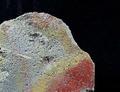
RED VS. YELLOWby BarryComment: I like the colors, although I don't think that the black background does much to enhance the subject. It also looks like maybe it was oversharpened a little bit too much. |
| 04/13/2005 05:14:24 PM |
|
| 04/13/2005 01:03:47 PM |
|
 Photographer found comment helpful. Photographer found comment helpful. |
| 04/13/2005 01:02:02 PM |
|
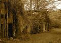
| 04/13/2005 12:59:52 PM |
Forest Ambushby SchuffComment: I like the concept, but I think the hue shift was a bit too extreme. It distracts from the overall feel of the image. |
| Photographer found comment helpful. |
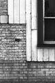
| 04/13/2005 12:58:42 PM |
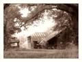
Timber & Bricksby robsmithComment: You did a great job of capturing the textures, but with such a tight crop you lose the context of those textures. |
| Photographer found comment helpful. |
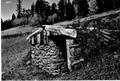
| 04/13/2005 12:56:51 PM |
Greenhousesby joebokComment: I like the subject and composition, but the flat contrast hides the textures instead of accentuating them. |
| Photographer found comment helpful. |
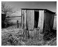
| 04/13/2005 12:55:41 PM |
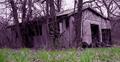
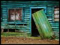
this old houseby scott photoComment: This looks like it might be a great shot, but it's too small to really tell. Also, it looks like you rotated it, but didn't crop out the background artifacts along the edge afterwards. I'd love to see a larger version of this. |
| 04/13/2005 12:53:42 PM |
|
| Photographer found comment helpful. |
| 04/13/2005 12:52:15 PM |
|
| Photographer found comment helpful. |
Home -
Challenges -
Community -
League -
Photos -
Cameras -
Lenses -
Learn -
Help -
Terms of Use -
Privacy -
Top ^
DPChallenge, and website content and design, Copyright © 2001-2025 Challenging Technologies, LLC.
All digital photo copyrights belong to the photographers and may not be used without permission.
Current Server Time: 08/21/2025 05:41:25 PM EDT.