| Image |
Comment |
| 04/27/2005 04:19:22 PM |
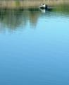
Boatingby cowcollectComment: This is a nice composition. I like how the boat is leading the viewer into the rest of the photo. I wish the figures in the boat were a bit more in focus, though. |
 Photographer found comment helpful. Photographer found comment helpful. |
| 04/27/2005 04:18:34 PM |
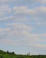
Standing Tallby rexComment: There doesn't seem to be any particular center of focus in this image. The sky is beautiful, but the trees in the foreground are a bit out of focus. If there were something of interest amongst those trees, it might be better. |
| Photographer found comment helpful. |
| 04/27/2005 04:12:20 PM |
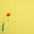
Red Tulip on Yellow Backgroundby Prof_FateComment: Very nice. I love how the yellow background is mirrored in the highlights on the tulip. And the lines of the flower draw the eye nicely into the frame. |
| Photographer found comment helpful. |
| 04/27/2005 04:11:27 PM |
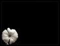
Isolated Beautyby mocabelaComment: Wow. Your conversion to black and white is flawless. I love the subtle leaf curling off to the right. |
| Photographer found comment helpful. |
| 04/27/2005 04:10:27 PM |
|
| Photographer found comment helpful. |
| 04/27/2005 04:09:43 PM |
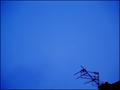
Arial Shotby kevrobertsonComment: Cool image. I love the way sillouhetting the subject enhances the shapes and textures and the angle draws the eye right into the frame. |
| Photographer found comment helpful. |
| 04/27/2005 04:08:43 PM |
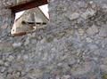
Alone in The Fieldby Texas MamaComment: Very nice photo. Your subject is placed perfectly and I love the texture of the plants in the foreground. Too bad about the spots, though. |
| Photographer found comment helpful. |
| 04/27/2005 04:07:08 PM |
8by gppacecarComment: I'm a big baseball fan, so this really strikes home for me. A couple of things that might improve the shot: The player's head corresponds with the line between the field and the outfield wall, it would be better if he was separated more from that (probably difficult to do based on where you were sitting). Also, he is right in line with one of the seams in the padding on the wall which is also distracting. Finally, while the subject is supposed to be small based on the challenge discription, he is a bit hard to make out at that distance, so maybe a slightly closer zoom would have worked better. All in all, though, a very nice shot. |
| Photographer found comment helpful. |
| 04/27/2005 03:45:49 PM |
Looking Upby 3DsArcherComment: I like this, but I think it would be better if the angle were such that the point of the building were pointing toward the upper right instead of straight up. |
| Photographer found comment helpful. |
| 04/27/2005 03:44:01 PM |
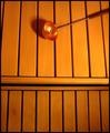
The Master of the Saunaby greslizzzComment: I like the colors and textures of this image. Placing the ladle (not sure what it's really called) at the top creates a lot of dramatic tension. That seems to conflict with the more soothing tones of the copper and wood. I wonder if rotating this 90 degrees counter-clockwise would resolve that. |
| Photographer found comment helpful. |
Home -
Challenges -
Community -
League -
Photos -
Cameras -
Lenses -
Learn -
Help -
Terms of Use -
Privacy -
Top ^
DPChallenge, and website content and design, Copyright © 2001-2025 Challenging Technologies, LLC.
All digital photo copyrights belong to the photographers and may not be used without permission.
Current Server Time: 08/23/2025 11:39:10 PM EDT.