| Image |
Comment |
| 04/25/2005 01:29:07 PM |
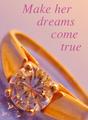
Go Aheadby StrikeslipComment: Dang...if only the gem was in sharper focus! This is very nicely set up, lit, cropped, worded, and edited. I really like the color choice of lavender with the gold. With the words, I would only make the letters a bit smaller (less significant) and in a more cursive font. Good luck! |
 Photographer found comment helpful. Photographer found comment helpful. |
| 04/25/2005 12:47:09 PM |
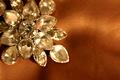
Elementalby utroComment: I believe I can see a fingerprint on the upper left gem.
The brown silk is nice. |
| Photographer found comment helpful. |
| 04/24/2005 01:06:04 PM |
|
| Photographer found comment helpful. |
| 04/23/2005 04:17:16 AM |
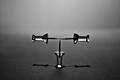
Tack Sharpby MontereykiddoComment: Chris, Congrats on 4th! Esp B&W is a huge accomplishment! Incredible clarity, dof, and perfect contrast! Jumps out at you! :)) |
| Photographer found comment helpful. |
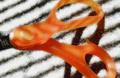
| 04/22/2005 02:51:27 PM |
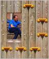
Scissorsby buddybuddy1226Comment: 640 pixels please, it is so hard to see quality when the shot is so small. Otherwise nice composition contrast and color. |
| Photographer found comment helpful. |
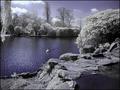
| 04/22/2005 02:46:06 PM |
Infrared Rocks!by marboComment: Very cool and lovely!
The bottom and left are blurred. I think this would be perfect if it were cropped tighter by about 25% on the left and about 15% on the bottom romoving the distracting specks in the middle of the pool and highlighting the lovely reflection. I am not familiar with a way to do infrared in digital, do you mind sharing with me? Did you just remove all color but Blue?
Good luck! - 9 |
| Photographer found comment helpful. |
| 04/22/2005 02:26:50 PM |
Celebrating the Creatorby glodaComment: This would be awsome if I could see the beautiful crystal. Perhaps a dark back-drop? and cropped tighter? Great idea! |
| Photographer found comment helpful. |
| 04/22/2005 02:21:01 PM |
Turquoise in rocky shapby h4hmrComment: Love lapidary stuff. This would be a better take if somehow you could not have the scratches. Also bump up the color saturation some and soften the light source so there is less reflection. Also focus could be a little better.
Check out this forum for the jewlery ad //www.dpchallenge.com/forum.php?action=read&FORUM_THREAD_ID=198722
Good luck! |
| Photographer found comment helpful. |
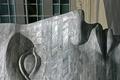
| 04/22/2005 02:07:56 PM |
Stare of stone.by cathysappComment: interesting, I would like it better if the metal dot 'above' the nose did not show (cropped out) and darder or with more contrast to show the lovely grain in the stone. Nice sculpture! :) |
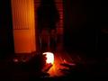
| 04/22/2005 01:54:29 PM |
R&Sby figmentComment: This is much too small, and dark, very hard to see anything.
If it were much larger and cropped to just the hands (if sharp) it would be very nice. |
Home -
Challenges -
Community -
League -
Photos -
Cameras -
Lenses -
Learn -
Help -
Terms of Use -
Privacy -
Top ^
DPChallenge, and website content and design, Copyright © 2001-2025 Challenging Technologies, LLC.
All digital photo copyrights belong to the photographers and may not be used without permission.
Current Server Time: 08/22/2025 08:27:35 AM EDT.