| Image |
Comment |
| 07/30/2002 12:51:00 PM |
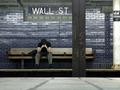
Back to Basics by dequinixComment: I know it's hard to get good lighting conditions in a subway, but it would have made the image more interesting. The glare on the bricks looks like it's due to a head-on flash. Otherwise interesting photo. |
| 07/31/2002 11:37:00 AM |
Foreign Flagby cthenkComment: The point you're making (the tag at the top, I'm guessing) barely stands out in the photo. |
| 07/31/2002 11:33:00 AM |
|
| 07/29/2002 04:17:00 PM |
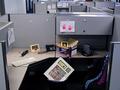
Corporate Giantby mikeysbistroComment: I find the background mess to be distracting, especially the conduit and the junction box. A good idea, but the elements of the photo you can't really control are hurting it. |
| 07/29/2002 06:39:00 PM |
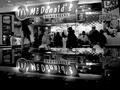
the most recognized name on the planetby tydComment: The way the reflection is working is confusing, and it might be due to the use of black&white. A soft flash-fill would have helped add detail to the customers across the center of the picture. Otherwise an interesting picture. |
| 07/31/2002 11:44:00 AM |
|
| 07/30/2002 01:51:00 PM |
|
| 07/30/2002 12:39:00 PM |
My Corporate Headacheby shortredneckComment: Good idea, but the limited depth of focus doesn't work well for this image (see the bottle). I'd only use that trick when you want to draw attention to near vs. far objects. Here it's distracting. |
| 07/30/2002 01:45:00 PM |
Sell Phoneby LanSnakeComment: The symmetry works, but otherwise the image needs more to it. |
| 07/30/2002 12:48:00 PM |
|
Home -
Challenges -
Community -
League -
Photos -
Cameras -
Lenses -
Learn -
Help -
Terms of Use -
Privacy -
Top ^
DPChallenge, and website content and design, Copyright © 2001-2025 Challenging Technologies, LLC.
All digital photo copyrights belong to the photographers and may not be used without permission.
Current Server Time: 08/01/2025 03:43:19 AM EDT.