DPChallenge: A Digital Photography Contest You are not logged in. (log in or register
 
Browse Settings
Currently viewing:
Registered Useralfresco

Show comments:

Per page:

Order:

Comments:


Comments Made by alfresco
Pages:   ... [131] [132] [133] [134] [135] [136] [137] ... [226]
Showing 1331 - 1340 of ~2259
Image Comment
Appealing
06/07/2006 12:54:53 AM
Appealing3rd Place
by KarenNfld

Comment:
Beautiful shot Karen!!! And soooo close to the seven, ask langdon for a recount!!
Photographer found comment helpful.
Everybody's Got Something to Hide Except Me and My Monkey
06/07/2006 12:52:26 AM
Photographer found comment helpful.
"Cellophane flowers of yellow and green..."
06/07/2006 12:32:26 AM
"Cellophane flowers of yellow and green..."
by SJCarter

Comment:
Nice score Jimmy but I think it's waaaay underrated
Photographer found comment helpful.
A Magical Place
06/07/2006 12:18:14 AM
A Magical Place1st Place
by SherwinJames

Comment:
Congrats!! I seem to recall someone saying you had many ribbons in your future! :)
She Loves You
06/07/2006 12:14:33 AM
She Loves You2nd Place
by MayaM

Comment:
YAY!!! WTG :)
Photographer found comment helpful.
Football Shaped
06/06/2006 05:04:26 PM
Football Shaped
by neophyte

Comment:
*A critique club comment*

Hello, I'm JP and I'll be doing your critique today. If you have comments or questions regarding this critique please feel free to pm me.

Enjoy your critique.

First impression:
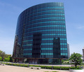
Hmmmm - why isn't anyone sitting on the benches.

Composition:
The inclusion of the benches/barrier dealy in the foreground is a distraction for me, they don't add to eye flow on the image. I would suggest getting closer to and have a more "looking up" perspective by you may have been limited by the field of view of your lens. I'm a huge fan of centered compositions when they are suited by the subject, but I don't think that is the case here, it appears you didn't want to cut the tree in lower right in half during cropping, but I think it may have helped the composition by cropping just to the left of the tree (you would have to include some of the tree branches but they would have been minor).

I love the alternating light/dark/light aspect of the windows - I think it would have helped immensely to find a way to draw the eye to that aspect of the photo. Maybe a crop where just the windows are visible, showing them off and the relfection of the two buildings.

I disagree with the perspective correction comment - it's not always needed and I feel it's not needed here, skewed perspective can be a positive making the image flow, it gives a sense of height.

Technicals (color,focus,light,etc)
The focus seems a bit off, and it seems noisey ... or maybe the hues just don't seem quite contiguous in some areas of the windows. The building seems soft.

lighting is good

I think the contrast and brightness need a little boost to help make the building pop out from the nice blue sky.

Relevance to challenge:
This is a form of architecture so it meets the challenge quite nicely.

Overall:
I feel the image received a score right around where it deserves. I think with a slightly different crop and a little more color management in processing you may have added to the score.

Keep up the nice work, I look forward to seeing your future work.

-jp
Photographer found comment helpful.
The Old Observatory
06/06/2006 04:40:19 PM
The Old Observatory
by SherwinJames

Comment:
*A critique club comment*

If you have any questions or comments please feel free to PM me. Enjoy your critique :)

First Impression:
Cool builing, love the sky and the clouds. I like the eye-flow the composition creates.

Composition:
Crop and composition are classic 1/3s which is pleasing to the eye. The perspective gives nice vertical lines drawing the eye through the structure. For me the tree in the bg (right center) is distracting as it takes away from the flow and blends too much with the building. I'm wishy-washy about the tree in the upper left, I think I would prefer you had cut that limb down but sometimes we can't do that. I love the use of triangle for the lawn/grass, it helps move the eye along.

Technical (color/focus/light)
Focus: spot on
lighting: good, I think having the doorway better lit may boost the aesthetics. Overall the building seems a little dark which takes some of the focus off the structure. I'm on a public-non-calibrated monitor so this may or may not be an issue, ymmv.
color: good use of sepia - I like it, and you have good tonal range.

Relevance to challenge
This is a form of architecture so it meets the challenge quite nicely.

Overall:
No oomph factor seems to have landed this in the mid-scoring range. I feel the main subject is washed out by the surrounding tree limbs.

My opinion is the final score reflects the inclusion of the distracting tree elements.

You have excellent work in your port and this is a nice photo as well but imo not up to your level, I look forward to your future entries - you have multiple ribbons in your future.

-jp
Photographer found comment helpful.
5x7-IMG_0419a_dpc_filtered.jpg
06/06/2006 09:40:09 AM
5x7-IMG_0419a_dpc_filtered.jpg
by dsa157

Comment:
What a face - she look so sad.
Photographer found comment helpful.
5x7-IMG_0476a_dpc.jpg
06/06/2006 09:39:35 AM
5x7-IMG_0476a_dpc.jpg
by dsa157

Comment:
A classic portrait look, he looks regal and aloof.
Photographer found comment helpful.
5x7-IMG_0367a_dpc.jpg
06/06/2006 09:38:40 AM
5x7-IMG_0367a_dpc.jpg
by dsa157

Comment:
The other end! Nice, it makes me wonder what he's thinking.
Photographer found comment helpful.
Pages:   ... [131] [132] [133] [134] [135] [136] [137] ... [226]
Showing 1331 - 1340 of ~2259


Home - Challenges - Community - League - Photos - Cameras - Lenses - Learn - Help - Terms of Use - Privacy - Top ^
DPChallenge, and website content and design, Copyright © 2001-2025 Challenging Technologies, LLC.
All digital photo copyrights belong to the photographers and may not be used without permission.
Current Server Time: 06/24/2025 04:26:41 PM EDT.