| Image |
Comment |
| 11/19/2004 07:12:27 PM |
|
 Photographer found comment helpful. Photographer found comment helpful. |
| 11/19/2004 07:10:34 PM |
Flyby lebowskiComment: I want to see more contrast, and more negative space |
| 11/19/2004 07:04:23 PM |
|
| 11/19/2004 07:01:35 PM |
|
| 11/19/2004 06:56:51 PM |
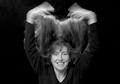
Fluffby magnusComment: The arms should either vanish or jump out, nice movement, but it requires more direction |
| Photographer found comment helpful. |
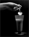
| 11/19/2004 06:54:38 PM |
Tapiocaby alsatiaComment: Id like to see more of the tapioca, the action of it dripping back into the cup instead of the suggestion. |
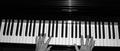
| 11/17/2004 12:42:45 PM |
Pianoby chookieComment: Watch the angle. Either accentuate it, or eliminate it. |
| Photographer found comment helpful. |
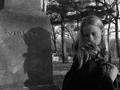
| 11/17/2004 11:58:04 AM |
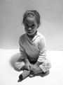
Black & White... and Violettby apboltComment: In a black and white picture contrast in the key, you get close, especially with the shadow, and the black jacket the girl is wearing, but you are missing the white. The rest of the picture is just grey scale. |
| Photographer found comment helpful. |
| 11/17/2004 11:53:20 AM |
|
| 11/17/2004 11:52:49 AM |
are ya talkin to ME !by ramiComment: a rare case where centering acctually works. try to use a sheet as a background to eliminate that pesky line of the corner, allowing you to focus more on the child and the look in her face. Id also suggest a new title, while this one may be cute, it could be better. |
| Photographer found comment helpful. |
Home -
Challenges -
Community -
League -
Photos -
Cameras -
Lenses -
Learn -
Help -
Terms of Use -
Privacy -
Top ^
DPChallenge, and website content and design, Copyright © 2001-2025 Challenging Technologies, LLC.
All digital photo copyrights belong to the photographers and may not be used without permission.
Current Server Time: 08/04/2025 10:15:59 AM EDT.