| Image |
Comment |
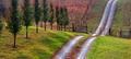
| 11/10/2005 03:46:36 PM |
At the Dimming of the Dayby susiComment: I think this is a very strong image. However, I wish it had included the tops of the nearest trees. The shape of the road is echoed by the tree trunks but cut flat at the trees. ( I guess you had crop something else from the top of the road maybe?) Even so the picture is very atmospheric. |
| 11/09/2005 06:02:37 PM |
Sunset on the other side of the riverby HVGB_photosComment: I think this picture would have been much stronger (and met the challenge better) if it had been cropped much lower, i.e. from just above the bright cloud on the centre/right. This would have added much more emphasis & impact to the main subject area. |
 Photographer found comment helpful. Photographer found comment helpful. |
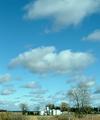
| 11/09/2005 04:23:09 PM |
Midwestern Iconby Rook3000Comment: Even though this picture is 90% sky and only 10% land I think it works really well. The buildings do seem a bit blurred though. |
| Photographer found comment helpful. |
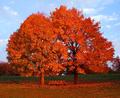
| 11/09/2005 04:09:32 PM |
Seatng for Sixby dpjerryComment: I like the strong colours, but think the blurred trees let the picture down. |
| Photographer found comment helpful. |
| 04/24/2003 03:19:36 PM |
Spring Tulipsby mjf999Comment: A beautifull picture, but had to deduct points for being in the wrong challenge - sorry. |
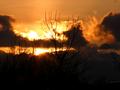
| 04/20/2003 05:39:15 PM |
An Icelandic fire skyby sissiComment: This is a lovely shot with heaps of atmosphere and interest in the clouds. However I think it would have been enhanced further by cropping off the bottom two thirds of the dark foreground. |
| Photographer found comment helpful. |
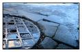
| 01/29/2003 02:42:48 PM |
Circle of squaresby vjozComment: This is a simple but very effective photograph. The reflection of the sky in the manhole cover matches perfecly with the colouration of the damp road/path. My only concern is with the bright edge along the top of the picture, which I find distracting - it interrupts the even tone and calm mood of the rest of the image. (I also wonder how the photo might have looked had it been cropped square; creating squares within a circle within a sqare - not a criticism by any means - just a thought - as I guess it might have made the crop too tight. A really excellent capture - well done. |
| Photographer found comment helpful. |
| 01/29/2003 06:06:13 AM |
|
| 01/28/2003 05:54:34 PM |
Bird Houseby DianaComment: A good idea and an attractive setting. However, I think a tighter crop would have been benficial. It would have reduced some of the negative space putting greater enphasis on the main subject and allowing greater detail to be seen. Still a pleasing image though. |
| Photographer found comment helpful. |
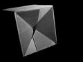
| 01/28/2003 04:31:47 PM |
dimensionby jurasComment: This is definitely a case of “Less is More”. The subject is so basic, yet from it you have produced a very striking image. I love the way the texture contrasts so starkly with the surrounding darkness and the way the side of the box falls away to nothing. This image definitely dispels any doubts that lighting is the key to a good photograph. I cannot offer any advice, but I am curious about how well the image may have worked if the top of the box was also unseen – did you try this?
An excellent shot – well done!
|
| Photographer found comment helpful. |
Home -
Challenges -
Community -
League -
Photos -
Cameras -
Lenses -
Learn -
Help -
Terms of Use -
Privacy -
Top ^
DPChallenge, and website content and design, Copyright © 2001-2025 Challenging Technologies, LLC.
All digital photo copyrights belong to the photographers and may not be used without permission.
Current Server Time: 08/03/2025 03:15:46 PM EDT.