| Image |
Comment |
| 12/02/2007 01:35:51 PM |
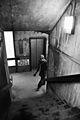
Paradise Lostby figaroComment: Good use of architectural line to lead the viewers eye through the frame and to the subject; however, I just wish he was doing something more interesting. Black and white treatment was definitely the way to go. Good job! |
 Photographer found comment helpful. Photographer found comment helpful. |
| 12/02/2007 01:34:34 PM |
Clear Blue Joyby debitiptonComment: Excellent capture of personality. Good use of point of view in that you aren't looking down at the child from above. My one small nit is that because her shirt matches the doorway, she's getting lost in it and doesn't pop out of the frame as much as she would if she'd been wearing a different color top. Overall, this is a very good shot. |
| Photographer found comment helpful. |
| 12/02/2007 01:32:01 PM |
Togetherby charstroke1Comment: I like the high key effect and the way you've used angle in the composition to create visual interest. The man suffers from floating head syndrome, though. Overall, this image has impact and I like it, so it's getting a good score. :) |
| 12/02/2007 01:31:01 PM |
Playmatesby alanfreedComment: Technicals here are well met with regard to exposure, composition, focus, etc. I don't mean to hurt your feelings, but this really seems like a standard portrait that you have to know the person to really like the image. There's no story - the girl and the cat aren't interacting -- there's no true personality captured or anything that makes me wish I was a) at the scene or b) knew the people in it. Technically though, you got it spot-on. Artistic merit - although pleasing, it's rather ordinary. |
| Photographer found comment helpful. |
| 12/02/2007 01:27:06 PM |
The Seven Sisters star clusterby jlanoueComment: Perhaps I'm not sophisticated enough to truly appreciate astrophotography; however, I like how you've used or created vignetting to make the subject cluster pop. |
| Photographer found comment helpful. |
| 12/02/2007 01:24:23 PM |
Little Miss Mischiefby MaryOComment: This seems a tad underexposed/lacking in contrast, but the facial expression is priceless and you've definitely captured personality here. |
| Photographer found comment helpful. |
| 12/02/2007 01:23:06 PM |
Duck!by TiNComment: This is one of those shots that needs more in the background for context, or to tell a story. Otherwise, it's an ordinary perspective of a duck, with good technical detail and lighting but there's really no visual drama here, or anything to evoke an emotion. Overall, I can see basic rules of composition were met and there is definitely technical merit here; I'm just not feeling any emotional attachment to the subject or location. |
| 12/02/2007 01:19:54 PM |
|
| Photographer found comment helpful. |
| 12/02/2007 01:18:47 PM |
The North Shoreby SachlichkeitComment: I can see basic rules of composition at work here with the placement of the horizon line and the rays of light. Something is missing though, perhaps it's visual drama or perhaps the whole thing is just a bit too blue? When I put my hand over the left side of the frame, I found I didn't miss it as part of the overal composition. The true focal point is the rays of light, and that should take up more of the frame. Overall, it's a decent image that with some different cropping could be even better. |
| Photographer found comment helpful. |
| 12/02/2007 01:14:47 PM |
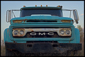
A Weathered Work Truckby JEFFJSBComment: This is a more interesting perspective that straight dead on - so kudos for trying to be interesting. To me, this screams for black and white treatment. The blue on the truck competes with the blue in the sky, and needs a teeny bit more contrast to break out the white bar and the GMC logo. I love that the side mirrors are different. :) The frame overall lacks depth; ordinarily I recommend shooting from an angle to show the long and wide sides of the subject to achieve that, but I see that you might have been going for a "smack at you" effect which does work here, as I do have a bit of a feeling like I'm about to get run over but wait (!) the truck is dead and abandoned. Phew. :) |
| Photographer found comment helpful. |
Home -
Challenges -
Community -
League -
Photos -
Cameras -
Lenses -
Learn -
Help -
Terms of Use -
Privacy -
Top ^
DPChallenge, and website content and design, Copyright © 2001-2025 Challenging Technologies, LLC.
All digital photo copyrights belong to the photographers and may not be used without permission.
Current Server Time: 08/18/2025 02:55:03 AM EDT.