| Image |
Comment |
| 09/11/2005 09:38:11 AM |
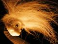
Thought Overgrowthby cycomerlin14Comment: Apparently this is a picture on the broader definitions of branch. Technically, the focus is short, bringing out detail in the hair. Try manual focus? or focus lock and either focus bracket or move in and out a bit. I like the colour tone.
It is an interesting picture to me because I am trying to find my "inner toy model" for my own shots, but I honestly can't quite grasp the connection to branch. Thoughts branching out? Where is the branching? Looks more like an explosion. |
 Photographer found comment helpful. Photographer found comment helpful. |
| 09/11/2005 09:34:26 AM |
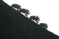
Branching Out!by cmstysComment: Focus point is a little bit too close. There appears to be a bit of a bright haziness to the tops of the bugs. Direct sunlight? Cool procession though. |
| Photographer found comment helpful. |
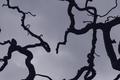
| 09/11/2005 09:32:51 AM |
Creepy Curvy Knarled and Knottedby space amoebaComment: Great feel for the picture. DOF is a bit low, but that gives a feeling of depth. There appears to be a rainspot in the middle of the shot. I don't think it takes away from the picture because it isn't a print and it's basic editing, but make sure you clean your lens before the next time you go shooting :). I like that the sky matches the mood perfectly, with just a little lumpiness. |
| Photographer found comment helpful. |
| 09/11/2005 09:30:20 AM |
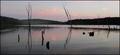
once upon a timeby hayleesComment: Soft and gentle. Very nice. very well done with the composition on the reflections up and down. |
| Photographer found comment helpful. |
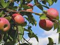
| 09/11/2005 09:29:06 AM |
Ready For The Pickinby JunieMoonComment: Beautiful colours. I come from apple country (Canada), and live in imported apples only country (Taiwan), so I appreciate the look of fresh tree-ripe apples.
The only thing I would have experimented with perhaps would have been a little bit of fill flash to even out the shadows a bit, and sliding the crop over a couple of millimiters to lose that tiny shadow on the left.
Otherwise, great contrast. |
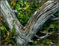
| 09/11/2005 09:26:38 AM |
To Everything There Is A Season...by rjksteschComment: Nice twist. I like the green contrasting with the bleached wood. It might look better with cleaner plants, but only to some. For me, I like the natural look.
I felt this was a better picture technically than it was aesthetically. |
| Photographer found comment helpful. |
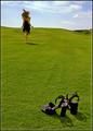
| 09/07/2005 12:05:14 AM |
Break Free by elsapoComment: Great picture!!! Congratzes.
BTW, the best way to deal with golfers is to unplug their golf carts and break into a loose jog. Most golfers are anti-activity (which is the heart of the game), so won't be able to keep up.
Love the colors! |
| Photographer found comment helpful. |
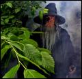
| 09/02/2005 11:58:26 AM |
Journey Through Middle-earthby Joey LawrenceComment: For what it's worth, regarding your choice of leaves, you were rather spot on. I am something of a LOTR geek and I will tell you that the stories were written to mirror the British Isles. These islands are loaded with old, final growth deciduous forests. It is said that unless there are factors that are extremely inhospitable to deciduous trees, they will be replaced within a few hundred years by deciduous trees which are a more sustainable type of tree. I can't vouch for the reliability of that statement, I learned it in grade 6 social studies in Canada. The fact that Britain is loaded with deciduous forests and has quite a mild climate would indicate that your choice of leaves is very good indeed.
Rock on Joey!
I would have tried to soften the light on the foreground leaves just a hair. I don't mind them photographically, but thematically, I think they conflict a bit with the mood of the fog lighting.
Hope it's helpful! |
| Photographer found comment helpful. |
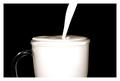
| 08/31/2005 10:10:25 AM |
On The Verge Of Overflowby lucasComment: Good use of the border, well matched.
Also, I like the shadows on top of the milk. That is what really made the pic come together.
Could have done better as a portrait though as others said.
Nice work! |
| Photographer found comment helpful. |
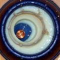
| 08/31/2005 10:04:13 AM |
Milk Moneyby CutterComment: This is really good. I don't dislike the background too much, but I agree with others who said a bigger saucer would have helped underneath.
The effect of a hole in milk is really good. I wonder if you could have made the milk look better if you had used cream or something a little heavier instead. There seems to be a lot of weird pink-orange colouring too. This is likely a byproduct of your main light source penetrating too far into the milk. |
| Photographer found comment helpful. |
Home -
Challenges -
Community -
League -
Photos -
Cameras -
Lenses -
Learn -
Help -
Terms of Use -
Privacy -
Top ^
DPChallenge, and website content and design, Copyright © 2001-2025 Challenging Technologies, LLC.
All digital photo copyrights belong to the photographers and may not be used without permission.
Current Server Time: 08/27/2025 06:46:28 PM EDT.