| Image |
Comment |
| 04/03/2005 04:15:01 PM |
|
| 04/03/2005 04:11:28 PM |
|
 Photographer found comment helpful. Photographer found comment helpful. |
| 04/03/2005 04:07:16 PM |
Liquid Alarm Clockby quidComment: Nicely done. I think diffusing the morning light on the mug would have resulted in a better image. |
| Photographer found comment helpful. |
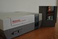
| 04/03/2005 04:06:22 PM |
The Beginning of Foreverby AvisComment: If anything, this is more of "in the middle" since you have Atari and other video game systems that pre-date the NES. While there's nothing wrong with the photo and I like the angle, I don't like the wooden tabletop and the bokeh on the video game cartridge. |
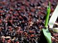
| 04/16/2004 09:13:01 AM |
Endless Chaos by scrum8Comment: Congrats :)
Anyone else find it funny that there's Chaos in Hell Michigan? *snickers* |
| 03/27/2004 10:09:48 AM |
What's up?by sahkoComment: Totally cool. At first I thought this was an edit. But then I read the description and developed a whole lot more appreciation for this photo. |
| Photographer found comment helpful. |
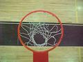
| 03/27/2003 12:18:58 PM |
Basketball?by thatguyComment: A visit from the critique club :)
As some of the previous people have mentioned, the image is grainy and a bit blurry but I think the camera is at fault here. I went back and looked through the images taken with an FD-73 and they all look similar to this. So, I guess you can't do much about that.
Some things that could be improved:
1. The lines on the court do not line up with the sides of the photo. It gives a strange visual to me. Kind of like abstracty art. I think eliminating or aligning them would improve the composition.
2. Add a ball. It seems simple but it would make for a much more dynamic image with a ball by the hoop.
I definitely like the idea and I think it has a lot of potential.
You can also try cleaning up the grain using NeatImage (there's a free demo) but your mileage may vary. |
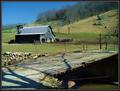
| 03/17/2003 01:18:03 PM |
Country Roadsby karmatComment: A visit from the Critique Club ;)
I like this image, but I think the emphasis here is on the building more than the bridge. I think you should make it stand out more. Different angle and point of view maybe? Even different lighting to strengthen the texture.
I'm not sure if you oversharpened this photo but I can see some jaggies in diagonal lines. I'm neutral on the colors they don't seem to be oversaturated but they have enough contrast to balance this photo out. Too bad about the shadows on the bridge.
I like how the photo displays the age of this bridge. And a nice sleek frame. A good contender but I think you could improve on this by using a different angle. |
| Photographer found comment helpful. |
| 03/09/2003 06:59:07 PM |
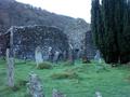
What we are, you will becomeby pimpvikingComment: A visit from the Critique Club :)
A very interesting photo. I think the biggest problem here is the lack of primary subject. I'm not sure exactly what the emphasis is. Are you emphasizing the withered grave stones or some other aspect of the photograph?
I like the exposure. It's dead on. Perhaps composition could be a bit better but that could be just because you have so much in the photo. |
| 02/16/2003 11:26:42 PM |
Eye of the house tigerby DanyComment: A visit from the critique club :)
Composition of this image is pretty good, possible improvements would be not to crop off the cats ears or, crop even more.
Small thing that I find annoying in my photos very often is when reflections of strange shapes on very reflective surfaces are visible. I don't think it's a problem here, looks natural.
Depth of field is decent. I'm not sure if I would like it a bit more. You have a lot of the important features in focus like the eye.
One thing I do find a tiny bit strange is the second eye. The angle you chose is ok but it would work better with the second eye visible. |
Home -
Challenges -
Community -
League -
Photos -
Cameras -
Lenses -
Learn -
Help -
Terms of Use -
Privacy -
Top ^
DPChallenge, and website content and design, Copyright © 2001-2025 Challenging Technologies, LLC.
All digital photo copyrights belong to the photographers and may not be used without permission.
Current Server Time: 08/04/2025 12:43:42 PM EDT.