| Image |
Comment |
| 04/21/2013 11:14:12 PM |
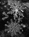
Snowflakes!by BuddyBaumComment: Love this... Did you have to use a reversed lens? I think I might have liked this more if you had cropped to just to the top flake... Good job, though. |
 Photographer found comment helpful. Photographer found comment helpful. |
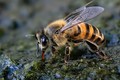
| 04/21/2013 11:13:11 PM |
caught in the actby rozComment: Great capture and good detail.
Light is too focused. Did you use a flash? If so, something like this might help next time : 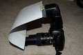 |
| Photographer found comment helpful. |
| 04/21/2013 11:13:04 PM |
Fantasiaby JudiComment: Lovely. Nice color in the background and good bokeh. The strands feel a little too chaotic and less "wispy", but over all very cool. |
| Photographer found comment helpful. |
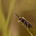
| 04/21/2013 11:13:01 PM |
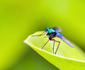
Viridian Vermin by pambComment: I love the color of the fly against the green. Very electric...
I do wish the front edge/point of the leaf wasn't so overexposed looking.
Great capture. |
| Photographer found comment helpful. |
| 04/21/2013 11:11:20 PM |
|
| Photographer found comment helpful. |
| 04/21/2013 11:11:17 PM |
Quenching her thirst by kasabaComment: A lot of good competition, but I'm expecting a high placement on this one... Good job Gaby...
(comment only) |
| Photographer found comment helpful. |
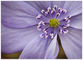
| 04/19/2013 04:24:30 PM |
Gently Foldedby SaraRComment: Only thing I can say is that I might have liked to see it a bit brighter...
Very lovely. |
| Photographer found comment helpful. |
| 04/19/2013 04:05:55 PM |
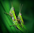
Big Big Worldby cynthiannComment: I still prefer the bright green background, but either way, it is quite a cool little critter... Good job!
(comment only) |
| Photographer found comment helpful. |
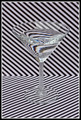
| 04/19/2013 04:04:22 PM |
:: Stripes ::by P-A-U-LComment: I think this shot is more interesting because it does not have bright colors. Certainly an intense study in refraction. Great idea...
A few details jump out to me that could have made this better.
1) Watch your horizon. Nevermind... I just pulled it into an editor to check and it is level. I guess the diagonal lines just make it look unlevel, and to voters, perception is reality.
2) The power in this (to me) is that it's not colorful. In that, I would have converted to B&W because I find the blue and orange bits in the refraction to detract.
3) The reflection off the front of the glass is distracting. It makes it too busy. Would a polarizer have helped? I think so... This, of the three, would have helped most, I think.
Of course, having looked at this for this long, I now find myself slightly dizzy. ;) |
| Photographer found comment helpful. |
| 04/19/2013 09:47:49 AM |
Peek-A-Boo!by hopefulcrafty1Comment: A decent attempt at this type of shot. A couple of details could have made it a stronger entry, I think. 1) Your mask doesn't have enough contrast to show up. Knowing what it is I see it if I look closely. More dynamic side lighting might have helped give the face some shape. 2) The background around the mask is cluttered. Having one solid color around the mask would have helped set it off as your subject. 3) The sharpness in the mask is good, but It needs to be there in the straw and drop as well. (This is ultimately why my shot like this failed and I went with something else) To get the drop and the subject of the refraction both in focus takes a lot of work.
Hope that helps and happy shooting! |
| Photographer found comment helpful. |
Home -
Challenges -
Community -
League -
Photos -
Cameras -
Lenses -
Learn -
Prints! -
Help -
Terms of Use -
Privacy -
Top ^
DPChallenge, and website content and design, Copyright © 2001-2024 Challenging Technologies, LLC.
All digital photo copyrights belong to the photographers and may not be used without permission.
Current Server Time: 04/29/2024 05:40:36 AM EDT.