| Image |
Comment |
| 01/08/2005 04:40:59 PM |
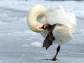
Ooh Aahby scrum8Comment: Originally placed in the mid-range holder, this image is very strong for the mood and essence of candid (even if it is not the typical subject-human). Most of the whites are textured, and not lost by blowout exposure, although the hind end of the bird could use a bit more detail or curve, it is not distracting. The neck however is overexposed on top. Some slight burning in selected areas and this would be finessed. I like it and am bumping from a 5 to a 7. |
| 01/08/2005 04:35:51 PM |
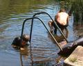
Looking for leechesby biggood53Comment: This shot does have a candid feel to it, but also feels like little more than a average snapshot. It holds a story that would have been better told by zooming in on the child facing us who appears to be looking at one of the leeches captured. This would have eliminated the overexposed highlights on the second child's back and left us with some very strong leading lines and no distracting extras like the float. Some slight dodging in the facial shadows of the main subject would then bring out the real subject. Overall a nice capture, but too wide an angle to have a big impact. Rating: 5. |
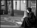
| 01/08/2005 12:21:13 PM |
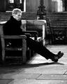
Waitingby PeterCComment: While I like the grain and the subject seems very candid, there is a lack of detail lost to the shadows that detracts from the whole. Darker areas are blobs of black and not clothing or shadows. This can be adjusted in a way by using the duplicate layers in PS and switching to screen until you get to the exposure you wish to have, then just black out the overexposed areas on the layers to return the correctly exposed areas to normal. A 7. |
 Photographer found comment helpful. Photographer found comment helpful. |
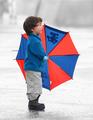
| 01/08/2005 12:17:33 PM |
What Does the World Have To Offer Meby bruskiComment: I started this image on the low end of my rating blocks, but in reviewing it deeper find that I am intrigued by it. The blown out window is placed perfectly, the child off centered just enough and it is simple to a T. A bit of burning in the hair to remove highlights and this image would be outstanding. It does not ooze 'candid', although I am sure that it fits the challenge. I find nothing else I can comment on here. I like the image, it would draw me in for another look and I think some people other than imediate family members would find it an inteesting piece to hang on a wall either framed or as a poster. Bumping from a 3 holder to a 6.
Revisiting this one and bumping again to a 7 |
| Photographer found comment helpful. |
| 01/08/2005 12:13:31 PM |
Fairground Rideby BobsterLobsterComment: Very nice tones, great placement of subjects on a 3rds rule, excellent use of the background image to balance the whole. A bit of a blowout on the railing and the white arm in the corner is somewhat distracting, but a great image anyway. Bumping to an 8 |
| Photographer found comment helpful. |
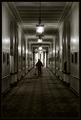
| 01/08/2005 12:10:30 PM |
The Janitorby tyt2000Comment: 3rds and be d@mnd on this one. It's great. Has a fine art feel to it, is a little on the dark side, but would make a great addition to any wall. While it does not seem to need a border, I don't think it detracts at all. Looks like the Mt Washington's Hallways. Bumping to an 8 |
| Photographer found comment helpful. |
| 01/08/2005 12:07:29 PM |
Petrified by an alien seaby WobbleComment: Artsy, surreal, reminds me of Land of the Giants in a way. A bit disappointed in the 50% land, 50% water perspective as a 1/3 perspective would push the art a bit more, but overall a great way to add something very unique to an otherwise boring candid. A 6. |
| 01/08/2005 12:03:57 PM |
Hey, look! by arpitaComment: Bumping this up to a 9. The colors are perfect and the desaturation of the rest puts all focus on the subject and the excited expression. Simple, focused and candid. Great! |
| Photographer found comment helpful. |
| 01/08/2005 12:02:10 PM |
"No Where"by ace flymanComment: A little too light on the face for me, but otherwise a great image. I like the beveled edge effect before the border as it seems to push the eye inward. Could use a slight counterclockwsie rotation to line up the posts and windows. Their alignment seems to cause a slight falling effect towards the right and tips the balance a bit too heavily. a 7. |
| Photographer found comment helpful. |
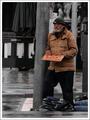
| 01/08/2005 11:58:06 AM |
Or Just a Smile if Nothing Elseby stragsComment: A slight rotation to pure vertical the pole would go a long way to putting a finishing touch on this shot. It seems selectively desaturated which I like, but wonder if the impact would have been more striking if you had left all colorized except for the sign holder. With him in the stark black and white, it would lend well to editorial commentary. A bit dark, and the walkman wearer in the background is a bit distracting, but overall a great capture. 7 |
| Photographer found comment helpful. |
Home -
Challenges -
Community -
League -
Photos -
Cameras -
Lenses -
Learn -
Help -
Terms of Use -
Privacy -
Top ^
DPChallenge, and website content and design, Copyright © 2001-2025 Challenging Technologies, LLC.
All digital photo copyrights belong to the photographers and may not be used without permission.
Current Server Time: 08/21/2025 04:58:21 PM EDT.