| Image |
Comment |
| 01/21/2005 11:28:33 PM |
com.jpgby mrsamsaComment: This one really seems to pop off the screen, nice job. |
 Photographer found comment helpful. Photographer found comment helpful. |
| 01/14/2005 05:20:06 PM |
|
| Photographer found comment helpful. |
| 01/09/2005 08:47:11 PM |
Native Indian Dancerby jonpinkComment: Despite the 50% ratio, I like this image and can't imagine it in a thirds rule world. The colors work wel together and his expression is great. One of the few borders that I didn't really care for, probably because the photo blends right into the white instead of having a clear delineator. Like thin black, white, thin black. Overall a very nice image tho. Bumping to an 8 |
| 01/09/2005 08:44:05 PM |
Happy Days by qmdiComment: High Key or overexposed? Not really sure, but I'm erring on the High Key cuz I think it works. Bumping from 6 to 8. |
| Photographer found comment helpful. |
| 01/09/2005 12:05:33 AM |
|
| Photographer found comment helpful. |
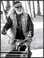
| 01/08/2005 04:56:33 PM |
Old ladyby sahkoComment: I like this shot. The face and detail of the age lines and clarity of the eyes is great. I think a bit soft on the DOF left as it seems her hair and arm should also be in focus. The highlights on this side seem too strong and draw the eye away from the subject. Overall tho a strong image. Bumping to 8 |
| Photographer found comment helpful. |
| 01/08/2005 04:55:09 PM |
Whistleblowerby jmsetzlerComment: This is a great image hurt only by the lack of definition in the hair that becomes shadow. A slight tweak in curves or use of the dodge tool on the top of his head might correct this and push the image up a couple notches. The whistle is also lost in the dof shadow, which really hurts the whole as it is part and parcel of the main subject. Since this is a desat, I would suggest offestting color and monochrome between the subject and the background. This would create the contrast you need to fully define his outline. How?: Create a duplicate layer of the original, and desat only that layer. Click the history brush tool into the color layers selection box and then select the desat layer. Brush in the color where it should be. A 6 with a big potential to be a 9. |
| 01/08/2005 04:48:47 PM |
Local Foodby yael27Comment: A lower depth of field would have done nicely to minimize the background elements, but the crop has also achieved a good minimizing of their effects. The color tones work well together and her expression is priceless for the candidness. I don't find the border to be distracting or overdone and all the elements seem to be in just the right place. Bumpt from 7 to 8. |
| Photographer found comment helpful. |
| 01/08/2005 04:45:18 PM |
Natural Beautyby librodoComment: If this is truely not a staged shot, then it is serendipity and planning at it best. Excellent DOF use, and softening of skin...ah crap, it's just freakin awesome OK? Bumpt to a 10. |
| Photographer found comment helpful. |
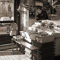
| 01/08/2005 04:44:12 PM |
Businessby jjbeguinComment: I have looked at this one many times. The old feeling to the color choice, the wide(squared) crop and everything that has been included work well to minimize the man's presence while not pushing him so far back as to make him unimportant. It is candid and the extra stuff from the wares for sale all the way to the tiled floor add to the ambiance. Only the highlight on his face seems somewhat diastracting to me and could easily be taken care of with a slight burn. Jumping from 6 to 8. |
| Photographer found comment helpful. |
Home -
Challenges -
Community -
League -
Photos -
Cameras -
Lenses -
Learn -
Help -
Terms of Use -
Privacy -
Top ^
DPChallenge, and website content and design, Copyright © 2001-2025 Challenging Technologies, LLC.
All digital photo copyrights belong to the photographers and may not be used without permission.
Current Server Time: 08/21/2025 01:25:42 PM EDT.