| Image |
Comment |
| 01/15/2007 01:30:33 PM |
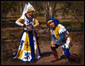
Since Medieval Timeby BrianRComment: A great image, strong contrasting coloration of subject and background, nice finesse. Appears staged which detracts a bit. Right on challenge concept.
Worthy of 3rd place ribbon to me.
( 8 ) |
 Photographer found comment helpful. Photographer found comment helpful. |
| 01/15/2007 01:29:17 PM |
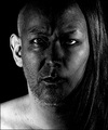
Internal Affairs by MAKComment: A disturbing image, very well executed and lit. Perhaps a bit oversharpened, but practically perfect. At least a 2nd place ribbon from me.
( 9 ) |
| Photographer found comment helpful. |
| 01/15/2007 01:27:31 PM |
|
| Photographer found comment helpful. |
| 01/15/2007 01:26:47 PM |
|
| Photographer found comment helpful. |
| 01/15/2007 12:38:17 PM |
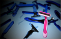
Last One Standingby phatphotoComment: Interesting concept, muddied by vignetting and cacophany of negative space vs competitors. Bit oversharpened (blades look jaggy). Pink seems like it should have been more prominent in the image (closer crop, closer focal point?)
( 5 ) |
| Photographer found comment helpful. |
| 01/15/2007 12:36:30 PM |
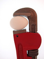
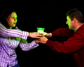
I Want You (She's So Heavy)by EVincentComment: I like this concept, but the lighting is flat on a profiled subject and thus the entire thing looks two-dimensional. I love the finesse, sharp, even focus, good definition of color and tones. A light turn of the wrench one way or the other would have upped the finish on this one.
( 5 ) |
| 01/15/2007 12:34:29 PM |
Red vs Blueby marvinComment: A tough translation to the challenge, but given the doubt. A good concept, well executed with DOF and crop - Noise levels in this image are really distracting and a pass with neat image would have raised the bar so to speak at least a point or two.
( 5 ) |
| Photographer found comment helpful. |
| 01/15/2007 12:27:06 PM |
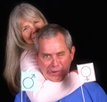
40 years and countingby sfmorrisComment: The use of the gender flags really took away from the impact of this otherwise great image. I loved the concept, expression and lighting. A narrower crop and no flags would have resulted in a 7 at least.
( 5 ) |
| Photographer found comment helpful. |
| 01/15/2007 12:25:29 PM |
Crossdressingby jrdawsonComment: Concept: Does not translate well without title.
Image Quality: Excellent. Nice finesse. Lighting is flat over majority of image and really hurts the overall. Could have used a slight rotation.
( 5 ) |
| Photographer found comment helpful. |
| 01/15/2007 12:20:40 PM |
Project "X"by Mal37Comment: Concept: Confusing translation to challenge subject. Unique but not superbly executed...too much negative space, scene appears contrived/posed.
Lighting: Excellent use of elements here. Nice color cast usage.
Subjects feel 'cut off' with the crop. A subtle backlighting would have gone a long way in this image, helping the subject's to not fall off into the shadow/background.
( 5 ) |
| Photographer found comment helpful. |
Home -
Challenges -
Community -
League -
Photos -
Cameras -
Lenses -
Learn -
Help -
Terms of Use -
Privacy -
Top ^
DPChallenge, and website content and design, Copyright © 2001-2025 Challenging Technologies, LLC.
All digital photo copyrights belong to the photographers and may not be used without permission.
Current Server Time: 08/22/2025 09:15:15 PM EDT.