| Image |
Comment |
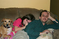
| 02/10/2007 11:13:32 AM |
Superbowlby KatmystiryComment: I think the dog is rooting for the team that nobody else is.... and I think you your daughter knows it. |
 Photographer found comment helpful. Photographer found comment helpful. |
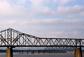
| 02/10/2007 11:12:11 AM |
2nd Street Bridge Day 5by KatmystiryComment: Hi Kat.
I know that it's sometimes hard to find a good vantage point to take pictures of these types of bridges and rivers. This is a great photo for sharing purposes. A better composition would be from an angled point of view. Less straight on.
It would really be cool to get underneath or below these bridges to be able to get both of them creating lines across different areas one lower one higher in the picture. |
| Photographer found comment helpful. |
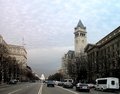
| 02/10/2007 11:09:28 AM |
Day 4: Pennsylvania Avenueby levyj413Comment: I might choose a slightly narrower crop from the top just to give the buildings a little bit more prominence And a slightly wider feel to the actual Avenue.
edit: cuz I'm an idiot and Jeff knows it. ;-) Message edited by author 2007-02-10 13:21:26. |
| Photographer found comment helpful. |
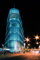
| 02/10/2007 11:02:45 AM |
URBAN Iceby ValdoComment: this is a great image! I didn't get to see the original one. But this is perfect. Great job |
| Photographer found comment helpful. |
| 02/10/2007 11:01:09 AM |
Day 5 Picaddilly Train Stationby ValdoComment: Valdo
I love the colors and the pattern and the line in this. A very slight rotation counterclockwise to level off the horizon (actually to level off the platform roof) will go a long way to an extra point if this was a challenge picture. |
| Photographer found comment helpful. |
| 02/10/2007 10:53:51 AM |
Bonusby xXxscarletxXxComment: very nice Amy!
What's really impressive about this is that each one of the inserts seems to have the same color toning, which occasionally is very tough.I like your choice of background and the pattern that you've used here too |
| Photographer found comment helpful. |
| 02/10/2007 10:51:01 AM |
3_TV-tower.jpgby junior_zComment: Hi Anna,
I'm wondering what was left on the left-hand side of the shot. A better composition choice would have been to have the tower on the right-hand side with the rest of the other towers stringing out along towards the left. This would've avoided is centered composition and gotten rid of a lot of those wires that are in the shot. And actually seemed to be more distracting than helpful. |
| Photographer found comment helpful. |
| 02/09/2007 01:36:39 PM |
Feb 5by elemessComment: In PS:
Duplicate the layer (background)
Select that layer, press ALT and the box with the dot in it (bottom of layers window) this creates a black mask on that layer.
Change the blend mode to Multiply.
Select your brush tool, set to 11% opacity and choose white.
Now paint a series of lines in white across the image going from left top to bottom right so that you have a zebra pattern in the black/white.
As you apply more strokes it will get darker on the area you are painting white.
Do this at 100% OPACITY and you'll see immediately what this is accomplishing. |
| Photographer found comment helpful. |
| 02/09/2007 11:21:14 AM |
Dave the Craneby TiNComment: The lighting here looks like an old Japanese Monster Movie! Nice work. |
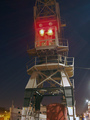
| 02/08/2007 08:57:36 PM |
Feb 5by elemessComment: Oy yes at first it does look like it should jump off the page...so I as well tried some quick stuff on it. A broad stroke burn pattern alternating with unburned 45 degree angle from left up to down right.
 |
| Photographer found comment helpful. |
Home -
Challenges -
Community -
League -
Photos -
Cameras -
Lenses -
Learn -
Help -
Terms of Use -
Privacy -
Top ^
DPChallenge, and website content and design, Copyright © 2001-2025 Challenging Technologies, LLC.
All digital photo copyrights belong to the photographers and may not be used without permission.
Current Server Time: 08/24/2025 12:08:33 PM EDT.