| Image |
Comment |
| 11/01/2004 05:59:47 PM |
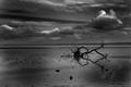
Aloneby reanimatedskyComment: I think I would have preferred a less central composition and the faded effect seems a little over done. |
| 11/01/2004 05:55:09 PM |
Fall at the Lakeby KathycComment: The view across the lake looks stunning and the foreground seems relatively dull in comparison to me, just find myself wishing I could see more of the view! |
 Photographer found comment helpful. Photographer found comment helpful. |
| 11/01/2004 05:52:26 PM |
|
| 11/01/2004 05:49:43 PM |
saturday afternoonby slonkoComment: Nice textures however the sand to the left of the tree looks a liitle too dark and draws my eye way from the focal point. |
| Photographer found comment helpful. |
| 11/01/2004 05:45:56 PM |
Virtuosoby GordonComment: Nice use of sepia, thirds, DOF and very cute shot, defiantly one for the family album. However I don't like the line in the background by the child�s head, it's not straight and perhaps a sheet could have been used to give a neater background? |
| Photographer found comment helpful. |
| 11/01/2004 05:40:18 PM |
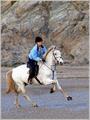
Sandy Runby cbonsallComment: Looks a little soft on the hoves, maybe a slightly faster shutter would have helped. Also some water splashing up would have really topped this off for me, but you have captured the motion of the horse well, so I geuss I can't have everything. Good Luck |
| Photographer found comment helpful. |
| 10/20/2004 05:11:55 PM |
Ghostly Delightby eaponygyrlComment: Lacking focus and it seems to me that there was very little though that went in to the composition, I would have preferred to see it positioned slightly off centre.
|
| Photographer found comment helpful. |
| 10/20/2004 05:02:28 PM |
Neonby divernickComment: Too much swoosh, very little for the eye to focus on. |
| 10/18/2004 07:57:09 AM |
Opposable Thumbby GeneralEComment: Didn't vote on this challenge, but I would have thought that this shot would have come higher. Great idea and take on 2001, just a shame it seemed to go over so many heads. |
| Photographer found comment helpful. |
| 10/18/2004 05:54:41 AM |
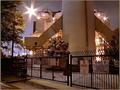
GATE 2by coolharComment: The light in the top left seems to be a little over powering and distracts from the rest of the shot imo.
|
| Photographer found comment helpful. |
Home -
Challenges -
Community -
League -
Photos -
Cameras -
Lenses -
Learn -
Help -
Terms of Use -
Privacy -
Top ^
DPChallenge, and website content and design, Copyright © 2001-2025 Challenging Technologies, LLC.
All digital photo copyrights belong to the photographers and may not be used without permission.
Current Server Time: 08/23/2025 02:44:06 PM EDT.